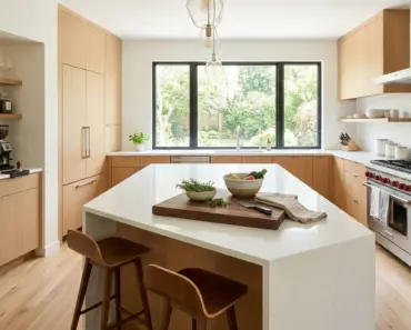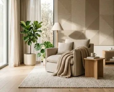

You spend months curating your living room. You pore over design magazines, invest in a premium performance-fabric sofa, hang expensive natural linen drapery, and select an exquisite vintage wool rug. Each individual item is beautiful in isolation. Yet when you step back into the doorway to view the completed space, something feels subtly, persistently wrong.
The room either feels clinical, sterile, and cold—like an anonymous luxury hotel lobby—or it feels cluttered, vibrating with an uncomfortable visual tension that tires your eyes after twenty minutes of sitting down. You move a chair, swap a throw blanket, or buy another decorative object, but the space refuses to settle into that elusive, grounded serenity you see in architectural portfolios.
The problem is rarely the furniture you chose, nor is it the square footage of the room. The problem is a failure of visual hierarchy. For decades, professional interior decorators have relied on a classic ratio known as the 60-30-10 rule. But modern cognitive neuroscience and ocular tracking research now reveal that this design formula is not merely an aesthetic convention; it is an exact mathematical match for the neurobiological architecture of human vision.
The Neurobiology of Looking: Saccadic Scanpaths and Cognitive Load
To understand why certain rooms feel instantly calming while others induce subconscious fatigue, you have to examine how the human brain processes an interior environment. When you enter a room, you do not absorb the entire space as a continuous, smooth panoramic photograph. Instead, your eyes engage in rapid, ballistic scanning movements known as saccades.
Three to four times every second, your eyes jump across different physical surfaces, pausing for tiny 200-to-300 millisecond snapshots called fixations. During each fixation, light enters the retina, passes through the optic nerve, and triggers massive neural firing in the primary and secondary visual cortices (areas V1, V2, and V4) located in the occipital lobe at the back of your brain.
The primary mandate of your visual cortex is boundary detection and Gestalt figure-ground segregation. It must rapidly determine what constitutes the stable, safe background (ground) and what constitutes a notable object or potential threat (figure). This categorization process consumes continuous metabolic glucose:
- The Monochromatic Void (90-10 or 100-0): When a room is painted entirely in a single white or flat gray without variation, the visual cortex struggles to detect depth and boundary edges. Deprived of focal anchors, the ocular muscles overwork, attempting to find a point of reference. The brain experiences sensory underload, which manifests psychologically as restlessness, sterile detachment, and emotional coldness.
- The Sensory Riot (33-33-33 or 50-50): When a space divides surface colors equally—for example, equal quantities of bright blue, dark orange, and cream—the visual system experiences acute competition. Areas V1 and V4 cannot establish which color is the background and which is the foreground. Saccadic scanpaths become erratic and frantic. The visual cortex is forced into continuous, high-effort arbitration, triggering sensory overload, cognitive fatigue, and elevated baseline stress.
The 60-30-10 rule is the precise mathematical antidote to this ocular chaos. By establishing a clear, unambiguous hierarchy of visual mass, it reduces cognitive processing load and guides saccadic scanpaths into smooth, tranquil loops.
The Golden Ratio of Interiors: Deconstructing the 60-30-10 Distribution
The 60-30-10 rule organizes the color and texture of an interior space into three distinct visual tiers, creating an organic hierarchy that mimics the natural outdoor world:
1. The 60 Percent: The Dominant Ground (Environmental Baseline)
Sixty percent of the visual plane in a room belongs to the dominant color. This is the visual canvas against which everything else is judged. In nature, this is the earth beneath your feet, the open canopy of the sky, or the vast green of the forest.
In a home, your 60 percent is comprised of:
- Primary wall surfaces and ceilings
- Large architectural millwork or built-in cabinetry
- The dominant field of your largest area rug or hard surface flooring
The dominant tone should almost always be a calm, low-saturation neutral or a soft, muted atmospheric hue (such as warm alabaster, gentle greige, bone white, or soft clay). Its biological function is to establish immediate figure-ground certainty. When 60 percent of a room is cohesive, your brain instantly recognizes the boundaries of the room, registers the space as safe and stable, and allows the visual cortex to relax its vigilance.
2. The 30 Percent: The Secondary Body (Structural Dimension)
Thirty percent of the visual surface belongs to your secondary color. In nature, this corresponds to the trunks of trees, the rocky face of a mountain, or dense foliage—elements that provide shape, contrast, and depth without overwhelming the horizon.
In interior architecture, the secondary 30 percent includes:
- Primary upholstered seating (the main sofa or sectional)
- Floor-to-ceiling window drapery panels
- Prominent secondary casegoods (such as a large natural oak dining table or walnut credenza)
- Accent armchairs or painted interior doors and trim
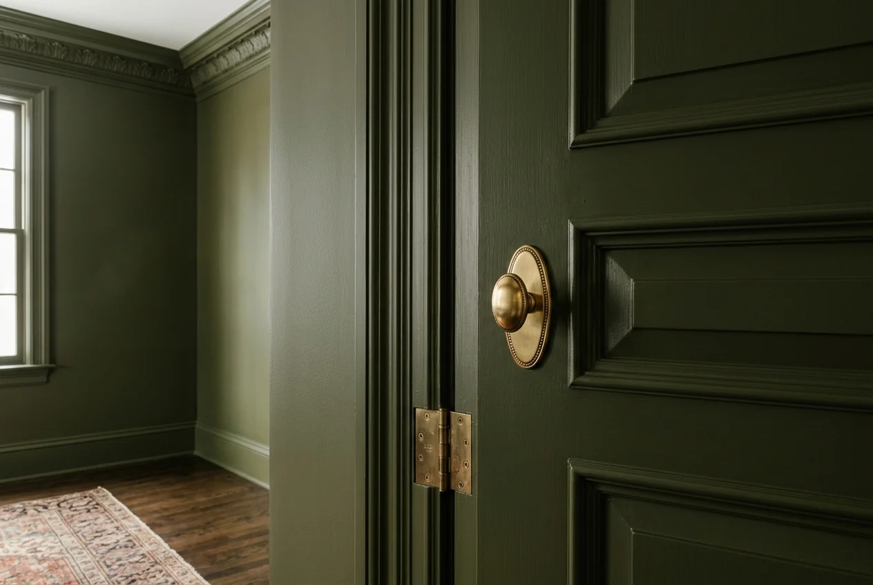
The 30 percent color must provide tonal contrast with the dominant 60 percent, but it must never compete for total dominance. It is the architectural anchor that prevents the 60 percent base from feeling like a hollow, empty void. If your dominant tone is warm cream, your 30 percent might be rich tobacco brown, deep charcoal, muted olive green, or warm caramel leather.
3. The 10 Percent: The Accent Spark (The Ocular Terminal)
Ten percent of the visual plane is reserved for the accent color. In nature, this is the vivid petal of a wild orchid, the bright flash of autumn berries, or sunlight glinting off a river pebble.
In your living space, the 10 percent encompasses:
- Decorative throw pillows and textured blankets
- Framed fine art and sculptural ceramics
- Metallic hardware finishes (unlacquered brass, blackened iron, brushed nickel)
- Fresh botanical arrangements and book spine accents
In ocular science, the 10 percent serves as the intentional “saccadic terminal.” After your eye scans the expansive 60 percent walls and sweeps across the structural 30 percent sofa, it naturally seeks a resting point—a moment of visual reward. A high-chroma, saturated 10 percent accent provides that focal resolution. It tells the brain: Here is the focal center; you may rest your gaze.
The Bridging Trap: Why High-Contrast Black and White Fails
One of the most widespread decorating blunders in modern open-plan homes is the stark 70-30 or 80-20 black-and-white scheme: bright white walls paired with stark matte black window trims, black light fixtures, and black furniture, with zero secondary bridging tones.
While this aesthetic looks striking in staged Instagram photographs, real-world inhabitants frequently complain that the space feels harsh, cold, and exhausting to live in. Cognitive vision research explains why: human eyes possess a dynamic range limitation known as simultaneous luminance contrast.
When the eye jumps directly from maximum light reflectance (pure white wall, Light Reflectance Value 90) to zero light reflectance (pure black metal, LRV 4), the pupil must constantly constrict and dilate with every saccade to balance the incoming light. Furthermore, the visual cortex experiences a violent edge-contrast spike known as the Mach band illusion, where edges appear artificially harsh and vibrating.
The beauty of the 60-30-10 rule is that the 30 percent tone acts as a cognitive bridge. By inserting warm middle tones—natural white oak, textural taupe, ribbed corduroy, or soft walnut—the luminance gradient between the 60 percent light base and the 10 percent dark or vivid accents is gently terraced. Ocular transitions become smooth, eliminating pupil strain and softening the architectural silhouette.
Tactical Execution: Three Proven Harmonization Formulas
To implement the 60-30-10 ratio in your own home, avoid treating it as a rigid paint-by-numbers exercise. Instead, apply it through three scientifically balanced palette families:
Formula 1: The Warm Biophilic Sanctuary
- 60% Dominant: Warm chalk plaster walls, natural woven jute area rug, and light bleached oak flooring.
- 30% Secondary: Deep moss olive-green velvet sofa, matching washed linen curtains, and a solid walnut coffee table.
- 10% Accent: Burnished antique brass picture lights, terracotta ceramic vases, and warm rust-orange embroidered throw pillows.
- Psychological Effect: Downregulates sympathetic arousal; mimics the dappled light and organic grounding of an open woodland clearing.
Formula 2: The Moody Architectural Study
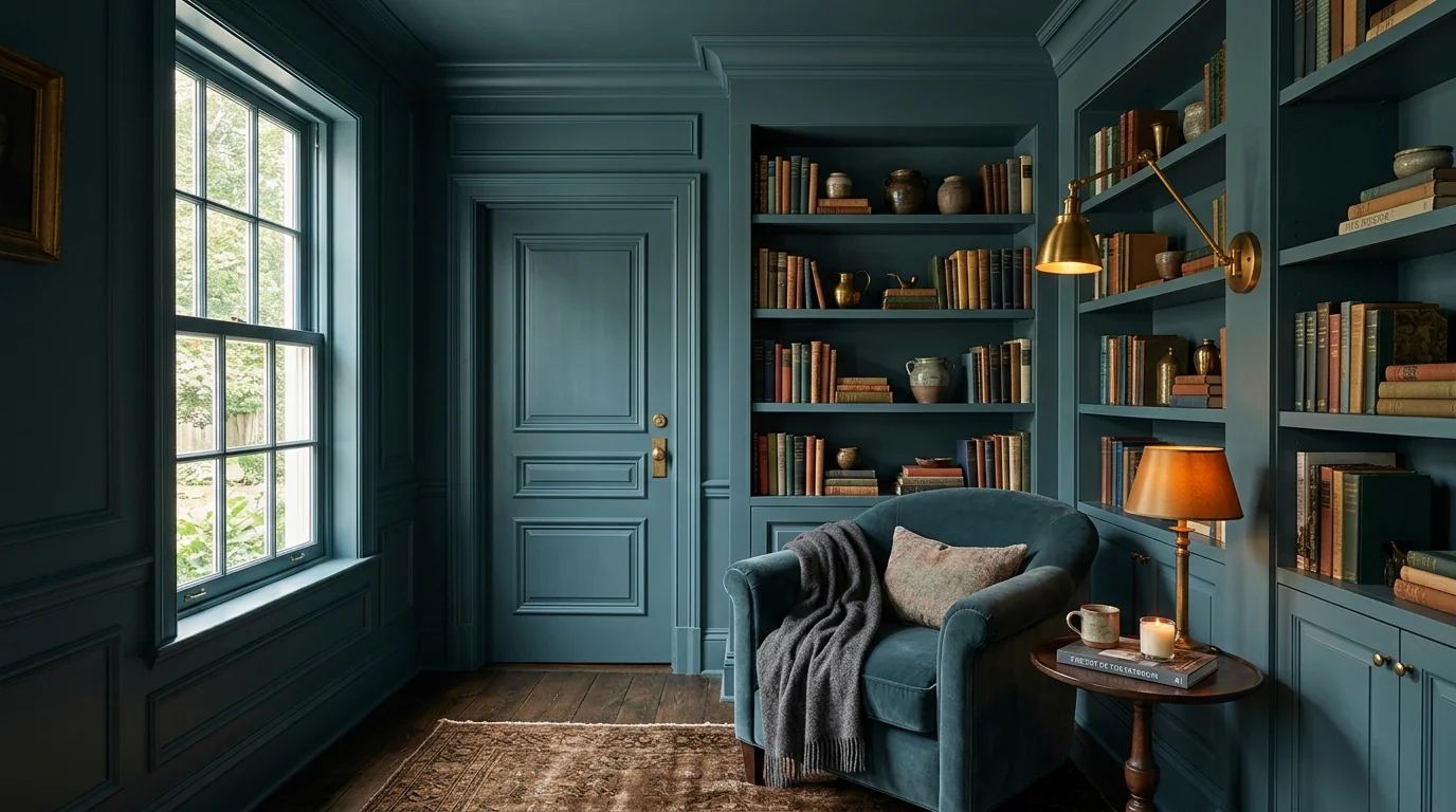
- 60% Dominant: Deep slate-teal color-drenched walls, woodwork trim, and ceiling.
- 30% Secondary: Warm amber leather lounge chairs, dark ebonized oak shelving, and a natural low-pile wool rug in oatmeal.
- 10% Accent: Crisp brushed chrome lamps, modern gallery artwork with thick white archival mats, and vivid cobalt blue ceramic bookends.
- Psychological Effect: Fosters intense cognitive focus, deep introspection, and a protective sense of acoustic and visual containment.
Formula 3: The Organic Modern Minimalist
- 60% Dominant: Soft bone-white lime-wash walls and a pale ivory textured wool-blend bouclé sectional.
- 30% Secondary: Rich fluted travertine stone tables, warm mid-tone white oak cabinetry, and sand-colored heavy linen drapes.
- 10% Accent: Hand-forged matte black iron candleholders, deep charcoal graphic sketch art, and rich cognac leather catchall trays.
- Psychological Effect: Maximizes natural daylight bounce while retaining structural weight, creating an airy, clutter-free mental spaciousness.
The Whole-Room Balancing Audit
If a room in your house currently feels unsettled, conduct this five-minute visual audit before spending money on new decor:
- Stand in the Primary Sightline: Stand in the main entryway or doorway where you enter the room most frequently. Close your eyes for five seconds, then open them.
- Trace Your First Three Fixations: Note where your eyes land first, second, and third. If your gaze bounces erratically between three different brightly colored pillows, a loud rug, and an accent wall, your 10 percent has metastasized into 35 percent.
- Unify the 60 Percent: Check if your walls and largest flooring element are in harmonic conversation. If your wall paint is cool blue-gray while your floor is warm honey oak, they are fighting for dominant status. Neutralize the largest surface.
- Establish the Missing Bridge: If you have an ivory sofa against ivory walls with black iron tables, add a 30 percent mid-tone layer—such as a warm camel wool throw, natural woven rattan armchairs, or taupe drapery—to bridge the luminance chasm.
When you align your interior palette with the cognitive requirements of human vision, a room stops being a mere collection of furniture. It transforms into an effortless neurobiological sanctuary where your eyes can roam smoothly, your mind can decompress, and true peace resides.
📥 Free Download: 60-30-10 Visual Harmony Calculation Worksheet
Cognitive load reduction formulas, saccadic eye tracking rules, and room surface area allocation checklists.