

Have you ever walked into a room where every piece of furniture was undeniably expensive, beautifully crafted, and immaculately styled—yet the entire space felt inexplicably jarring or subtly uncomfortable to inhabit? You cannot immediately pinpoint why. The color palette harmonizes, the upholstery feels luxurious, and the lighting is warm. Yet your eyes dart restlessly from corner to corner, your shoulders maintain a faint muscular tension, and navigating across the room requires conscious mental recalculation of your footsteps. Conversely, you have likely stepped into other rooms where you instantly took a deep, restorative breath—spaces where your gaze effortlessly glided through the architecture and every piece felt anchored with quiet, inevitable permanence.
That immediate biological sensation is not an accident of aesthetic taste or whimsical styling luck. It is the direct neurological reaction of your ocular and spatial processing systems calculating spatial proportion. When an interior feels “off,” your subconscious brain is struggling to reconcile contradictory sensory inputs regarding spatial volume, gravitational mass, and functional clearance. In this comprehensive masterclass on spatial geometry, you will uncover the underlying mathematical principles that govern human visual comfort, master the foundational 2:3 golden ratio rule of furniture scale, and learn how to engineer flawless visual flow, balanced negative space, and intuitive circulation throughout your home.
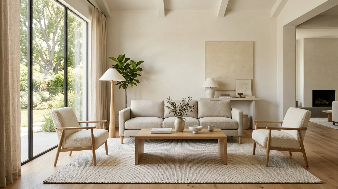
The Neurological Biology of Spatial Perception
To master the arrangement of living spaces, you must first understand how your visual cortex decodes three-dimensional environments. The human ocular system does not evaluate a room as a single, static panoramic photograph. Instead, your eyes perform rapid, involuntary scanning movements known as saccades, darting across objects two to three times per second, punctuated by brief 200-to-300-millisecond pauses called fixations. During these micro-fixations, the parvocellular and magnocellular visual pathways process contrast, spatial boundaries, and geometric relationships, feeding real-time positional data to your parietal lobe.
Your parietal cortex is responsible for building your internal mental map of peripersonal space—the immediate, reachable zone extending roughly three feet around your physical body. When furniture pieces within a room are disproportionately massive, crowded against circulation corridors, or crammed into corners without adequate breathing room, your parietal cortex continuously registers subconscious threat warnings. Even if an object does not physically strike you, its claustrophobic proximity within your visual perimeter elevates micro-levels of cortisol and activates low-grade sympathetic nervous system vigilance. You feel crowded because your brain cannot compute an unhindered path of physical movement.
Conversely, when an expansive room is furnished with undersized, spindly items floating aimlessly in massive empty voids, your magnocellular system perceives visual instability. Without clear structural anchoring points, the eye experiences visual fatigue from endless open drift. The golden ratio and its practical design derivative—the 2:3 proportion rule—solve this perceptual dilemma by creating mathematical hierarchies that perfectly mirror the fractal geometries and proportional distributions found throughout the natural physical world.
The Golden Ratio and the Subconscious 2:3 Proportion Rule
For millennia, mathematicians, architects, and classical masters have observed that the Greek letter Phi (\(\phi\)), representing the golden ratio of approximately \(1.6180339887\), appears repeatedly in natural growth patterns—from nautilus shells and sunflower seed spirals to branching river deltas and the anatomical proportions of the human skeletal frame. Expressed simply, two quantities are in the golden ratio if their ratio is the same as the ratio of their sum to the larger of the two quantities:
The Golden Section Formula: \(\frac{a + b}{a} = \frac{a}{b} = \phi \approx 1.618\). In interior architectural design, this mathematical relationship translates into the golden proportion rule: dividing any space or object group into approximately 60% dominant mass (\(a\)) and 40% secondary counterweight (\(b\)), which resolves to a clean, practical 2:3 ratio.
When you align the physical dimensions and visual mass of your furnishings to this 2:3 ratio, you tap into hardwired ocular pattern recognition. The human eye inherently recognizes the larger mass as the foundational anchor, while the adjacent smaller mass provides complementary visual interest without competing for dominance. Below is a breakdown of how the classical Fibonacci sequence translates into functional room proportions:
- The 1:1 Mirror Trap (Equilateral Competition): Placing two elements of identical visual mass side by side (such as a 72-inch sofa paired with a 72-inch coffee table) forces the brain into an ocular ping-pong loop. Neither object takes precedence, resulting in static, monotonous tension.
- The 1:2 Extreme Disconnect (Diminutive Isolation): Pairing an object with another that is less than half its size (such as an 84-inch sofa with a 36-inch miniature table) causes the secondary object to appear lost, accidental, and physically orphaned within the room.
- The 2:3 Golden Harmonization (Balanced Hierarchy): Scaling the secondary element to approximately two-thirds (62% to 67%) of the primary anchor creates instant perceptual cohesion. The primary object grounds the field, while the secondary element establishes functional grace.
The Primary Living Room Equations: Sofa, Coffee Table, and Rug
The living room represents the most complex spatial calculation in residential design because it requires balancing major architectural seating with dynamic social circulation and tactile surfaces. When designing your seating grouping, three critical geometric calculations dictate whether the space feels effortless or awkward.
1. The Sofa-to-Coffee Table Length Equation
The most frequent furniture sizing error committed in residential interiors is the mismatch between the main sofa and the central cocktail or coffee table. A coffee table that matches the exact length of your sofa suffocates circulation and creates a monolithic barrier. A table that is too petite looks like an isolated tray floating in an empty ocean.
To establish perfect visual weight, apply the 2:3 length rule: your coffee table should measure between 60% and 67% of the total interior seating length of your sofa (excluding wide, bulky rolled arms if applicable). For instance:
- Standard 84-Inch Sofa: Optimal coffee table length = 50 to 56 inches (84 × 0.62 = 52 inches).
- Compact 72-Inch Apartment Sofa: Optimal coffee table length = 44 to 48 inches (72 × 0.62 = 44.6 inches).
- Expansive 108-Inch Sectional (Main Span): Optimal coffee table length or clustered table diameter = 65 to 72 inches (108 × 0.62 = 67 inches).
Beyond horizontal length, vertical height must be calibrated against biomechanical reality. The tabletop should sit 1 to 2 inches lower than the top of your sofa seat cushions, typically between 16 and 18 inches off the finished floor. If the table rises higher than the sofa cushions, it disrupts sightlines and feels like an imposing dining obstacle. If it sits lower than 15 inches, reaching for a beverage requires an awkward forward lumbar strain that disrupts relaxed postural alignment.
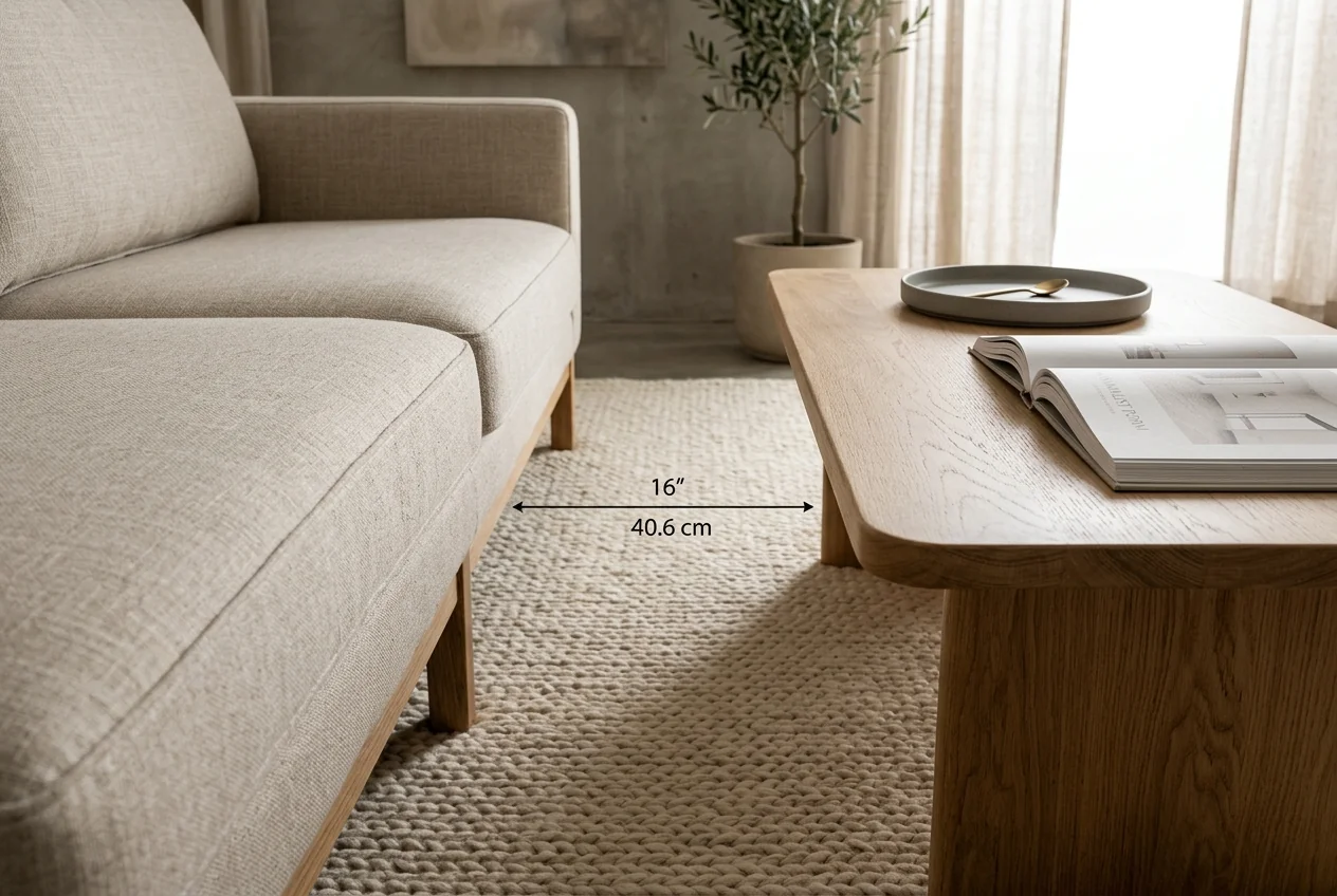
2. The Ergonomic Clearance Corridor: The 16-to-18-Inch Rule
Even a perfectly proportioned coffee table will ruin a room if its placement violates kinetic movement tolerances. The critical distance between the front edge of the sofa seat cushion and the nearest edge of the coffee table must measure precisely 14 to 18 inches (with 16 inches representing the absolute ergonomic sweet spot).
Here is why this narrow tolerance window is non-negotiable: a gap narrower than 14 inches constricts human knee clearance, forcing seated guests to turn their legs sideways or scrape their shins when rising. A gap wider than 18 inches exceeds the natural forearm reach of an adult torso seated against a backrest, forcing people to repeatedly pitch forward at the hip simply to place down a coffee mug or glasses. At exactly 16 inches, you achieve fluid kinetic clearance for legroom while maintaining effortless tactile reach.
3. Area Rug Scale: The 2:3 Perimeter Boundary Reveal
An area rug is not merely a soft textile underfoot; it is the visual foundational canvas that defines the architectural boundary of a conversation zone. Floating an undersized rug in the center of a room—commonly known among architects as the “postage stamp syndrome”—instantly shrinks the perceived square footage of the entire living room by cutting the floor into fragmented visual patches.
To calculate proper rug dimensions, apply the 2:3 ratio to your room’s architectural floor boundaries:
- The Perimeter Reveal: An area rug should leave approximately 12 to 18 inches of exposed finished flooring between its outer edge and the room’s baseboards in standard rooms (expanding to 24 inches in grand rooms over 500 square feet). This 14-inch perimeter border frames the seating grouping like an art mat inside a picture frame.
- The Front-Leg Grounding Rule: At an absolute minimum, the front legs of every primary seating element (sofas, accent lounge chairs, and benches) must sit firmly at least 8 to 12 inches onto the rug. Anchoring the front legs on the woven textile pulls disparate furniture pieces into an unified, cohesive spatial conversation. Leaving accent chairs stranded outside the rug boundary creates psychological detachment, signaling to occupants that the perimeter chairs are auxiliary rather than integral to the gathering.
The Visual Weight Hierarchy: Density, Leg Architecture, and Light
Geometric dimensions only tell half the story of spatial flow. The other half is governed by visual weight—the perceived gravitational density that an object projects into a room based on its material, silhouette, coloration, and base construction. Two pieces of furniture with identical physical tape-measure dimensions can possess drastically unequal visual footprints.
Solid Plinths vs. Elevated Leg Frames
Consider two credenzas, both measuring 72 inches wide, 20 inches deep, and 30 inches high. The first is a solid, ebonized walnut plinth cabinet that sits flush on the hardwood floor with no open space beneath it. The second is a bleached ash console resting on slender, tapered 10-inch brass legs. While their physical volumetric footprints are identical, the solid plinth cabinet exerts nearly triple the visual weight of the elevated console.
Why does this occur? Because human spatial awareness calculates room boundaries by reading the continuous surface of the floor. When light passes beneath a credenza or sofa, your ocular system perceives the room’s floor plane continuing unobstructed all the way to the baseboard wall. In smaller living rooms (under 250 square feet), filling the space with skirted sofas, solid boxy armchairs, and floor-hugging storage units completely blinds the eye to the actual floor dimensions, making the room feel compressed and suffocating.
The Visual Counterbalance Formula: For every heavy, grounded piece with solid visual weight (such as a deep sectional or a stone-clad fireplace), you must integrate two lighter, elevated elements featuring exposed leg architecture, cantilevered forms, or glass/wire elements to maintain atmospheric equilibrium.
Color Luminosity, Specular Reflection, and Negative Space
Visual weight is equally manipulated by how materials absorb or reflect ambient photons:
- Luminosity and Chromatic Saturation: Dark, matte, highly saturated surfaces (such as charcoal velvet or ebonized wood) absorb incident light, causing them to appear heavier, denser, and visually closer to the viewer than they physically are. Pale, desaturated tones (such as natural linen, bleached oak, and ivory bouclé) reflect light, receding into the background and expanding perceived volume.
- Specular Transparency: Glass, polished acrylic, and open metal wirework permit sightlines to pierce straight through the object. A glass-topped cocktail table allows the eye to trace the intricate patterns of the rug underneath, effectively reducing its visual weight to zero while maintaining full functional utility.
- Negative Space as an Architectural Element: Negative space—the open air between objects—is not empty waste; it is the structural pause that allows positive shapes to be comprehended. Without intentional negative space, an interior becomes sensory noise. By adhering to the 2:3 proportion, you ensure that negative space occupies approximately one-third of every major elevation and floor plane.
Vertical Wall Elevation: The 60/40 Vertical Distribution Rule
When decorating walls, homeowners often think exclusively in two dimensions: centering an artwork horizontally on a blank drywall expanse and driving a nail into the wall. This ignores the critical vertical axis that links floor furnishings to the ceiling plane.
The Eye-Level 57-to-60-Inch Centerline
Galleries and museums across the globe hang art based on a universal standard: 57 to 60 inches from the finished floor to the exact optical center of the artwork. This metric corresponds directly to the average human eye level, allowing the viewer to engage with the composition without craning their neck upward or stooping downward.
However, when hanging artwork or installing decorative mirrors directly above a horizontal furniture piece—such as a console table, sofa backrest, or bedroom headboard—the 2:3 golden ratio takes precedence over the isolated eye-level rule:
- The 2:3 Width Span: The total width of the artwork (or the collective width of a multi-frame gallery grouping) should span between 60% and 75% of the furniture’s width below it. A 30-inch painting hung above an 84-inch sofa looks marooned and adrift; an 80-inch frame hung over a 72-inch console feels top-heavy and ready to crush the furniture beneath it.
- The 6-to-8-Inch Vertical Gap: The bottom edge of the frame should hover exactly 6 to 8 inches above the highest point of the furniture piece. Hanging the frame 12 or 16 inches above the back of the sofa severs the visual connection between the two objects, creating two disconnected islands rather than a unified vertical composition.
- The Vertical Elevation 60/40 Split: When viewing an entire wall from floor to ceiling, aim for the furniture and lower architectural anchors (wainscoting, millwork, consoles) to occupy the lower 40% of the vertical plane, while intentional negative space, artwork, and pendant lighting occupy the upper 60%.
Dynamic Circulation Corridors: Major vs. Secondary Flow Pathways
A room can appear visually balanced in a static photograph, yet prove deeply frustrating to inhabit if daily foot traffic collides with physical obstacles. Fluid interior spatial design requires establishing distinct hierarchy between major arterial circulation corridors and secondary intimate pathways.
Primary Arterial Corridors (36 to 48 Inches)
Major circulation routes—the pathways connecting room entryways, passage to exterior doors, routes between the kitchen and dining area, and main hallways—require a minimum clear width of 36 inches, with 42 to 48 inches representing luxury accessibility. A 36-inch clearance allows two adults to pass one another without awkwardly twisting their shoulders sideways. Constricting a major entry threshold below 32 inches creates an immediate physical bottleneck that makes your entire home feel cramped, stressful, and poorly engineered.
Secondary Access Pathways (24 to 30 Inches)
Secondary pathways—the routes that navigate between an accent chair and an end table, the perimeter path around a dining table, or the space between a bed and a bedroom dresser—operate under different functional tolerances. These intimate corridors require a minimum clearance of 24 to 30 inches. This provides sufficient room for an individual to walk unhindered, pull out a dining chair, or open a dresser drawer without the drawer face slamming into an opposing mattress or wall.
📥 Free Download: Golden Ratio Spatial Scale & Furniture Matrix
The 2:3 proportion rule, visual weight balancing equations, 16-inch kinetic clearances, and museum-standard vertical elevation charts.
✓ Includes: Tactical Checklist
✓ Access: Instant Free Download
Practical Room-by-Room Proportion Case Studies
To see these mathematical principles in real-world action, let us examine how the 2:3 golden ratio transforms three primary living zones from chaotic frustration into architectural harmony.
Case Study 1: The Small Urban Living Room (14 ft × 12 ft)
The Common Mistake: Pushing a massive, oversized, skirted 96-inch sectional sofa flat against the back drywall, paired with a heavy 36-inch square wooden storage ottoman and a 5×7 area rug that floats in the center, leaving all sofa legs on bare floor.
The Golden Ratio Correction:
- Select an 80-inch tailored sofa with slender 7-inch elevated wooden legs to reveal floor expanse.
- Pair with a 50-inch oval cocktail table with slender metal legs (80 × 0.62 = 49.6 inches, adhering to the 2:3 ratio). The oval silhouette softens circulation flow in the tight perimeter.
- Install an 8×10 foot hand-loomed wool flatweave rug, leaving 14 inches of bare hardwood floor reveal around the room perimeter, with the sofa’s front legs placed 10 inches onto the rug.
- Float the sofa 6 inches off the wall rather than plastering it flat against the drywall; this subtle perimeter gap introduces shadows and negative space that paradoxically makes the room feel wider and deeper.
Case Study 2: The Open-Concept Dining Room
The Common Mistake: Suspending a tiny 18-inch glass pendant chandelier 40 inches above an expansive 96-inch solid rustic dining table, creating an immense, empty void in the vertical sightline.
The Golden Ratio Correction:
- Apply the 2:3 scale to lighting diameter: chandelier diameter should measure approximately one-half to two-thirds the total width of the dining table. For a 42-inch wide table, choose a linear fixture or chandelier spanning 24 to 28 inches in diameter.
- Suspend the bottom of the lighting fixture precisely 30 to 34 inches above the finished tabletop. This positions the fixture low enough to intimately anchor the dining circle without obstructing seated eye-to-eye conversational sightlines across the table.
- Maintain a 36-to-42-inch clearance from the edge of the table to the nearest wall or buffet credenza, ensuring guests can comfortably push back their chairs and stand up without bumping against millwork.
Case Study 3: The Primary Bedroom Sanctuary
The Common Mistake: Flanking an imposing, king-size upholstered bed with miniature, spindly 18-inch nightstands and hanging small 12×16 picture frames adrift on a massive 12-foot accent wall.
The Golden Ratio Correction:
- A standard King bed measures 76 inches wide. To balance this substantial horizontal anchor, nightstands should each measure 26 to 30 inches wide (roughly one-third of the bed width on either side).
- Ensure nightstand tabletop height sits level with, or within 2 inches above, the top of the mattress for effortless nighttime reach.
- Install an 8×10 or 9×12 foot area rug oriented perpendicular to the bed frame, extending at least 24 to 36 inches beyond the sides and foot of the mattress, ensuring a soft, warm landing for bare feet every morning.
The 7-Step Architectural Space Planning Checklist
Before purchasing a single piece of furniture or rearranging your current layout, use this systematic checklist to ensure every element aligns with mathematical harmony:
- Measure the True Perimeter: Map your room’s exact architectural dimensions, noting window reveals, door swings, HVAC registers, and electrical outlet positions.
- Establish the Primary Anchor: Identify the functional focal point (fireplace, architectural view, or media credenza) and place your largest seating piece directly aligned to it.
- Calculate the 2:3 Subordinate Scale: Measure the width of your primary anchor and multiply by 0.62 to 0.67 to determine the exact target width for your coffee table, console, or artwork.
- Audit the Leg Architecture: Count your furniture bases. If you have two heavy, floor-hugging pieces, ensure all adjacent items feature elevated legs, cantilevers, or light-permeable materials.
- Map the Circulation Corridors: Use blue painter’s tape to mark 36-inch minimum pathways for major arterial routes and 16-inch gaps between seating and table surfaces.
- Calibrate Vertical Art Heights: Ensure artwork spans 60% to 75% of the furniture piece beneath it, with an eye-level center hung 57 to 60 inches from the floor.
- Perform the “Squint Test”: Stand in the primary doorway of the room, squint your eyes until details blur, and assess the silhouette masses. If visual weight pulls heavily to one corner, redistribute a grounding element or adjust negative space until the room settles into serene, effortless equilibrium.
By shifting your perspective from isolated furniture shopping to holistic spatial mathematics, you eliminate the costly trial-and-error cycle of home decorating. When your home is governed by the timeless proportions of the golden ratio, its visual harmony becomes unmistakable: your rooms feel naturally expansive, navigation feels intuitive, and every space invites your nervous system to fully unwind.