
You stand back, roller in hand, admiring the fresh coat of paint. The color looked so promising on that tiny chip. But now that it covers an entire wall, your heart sinks. The wrong paint color can turn your dream room into a regret. Paint is one of the simplest and most inexpensive ways to transform a room, but it is also one of the easiest to misjudge.

Why is bright red so risky?
Bright red makes a powerful statement, but according to Isfira Jensen, CEO and principal designer at Jensen & Co Interiors, it is a color most people will regret, especially on a large surface. That fire-engine intensity can feel exciting for about five minutes. Then it starts to close in. Red often promotes restlessness and tension, which is the opposite of what you want when trying to relax or fall asleep.
Terri Brien, owner and principal designer at Terri Brien Interiors, points out that red is linked to energy and even tension. In a bedroom or a living area, that constant low-level buzz can be draining. Instead of a cozy retreat, you get a room that feels like it is vibrating.
Is there a way to soften bright red so it works in a room?
You do not have to give up on red entirely. The problem is usually the full-strength version. If you love the warmth and drama, switch to a muted crimson, a deep burgundy, or a dusty rose on just one accent wall. You keep the personality without the overwhelm. Another trick is to bring red in through furnishings and art rather than painting all four walls. A velvet sofa or a gallery wall with red accents gives you the same kick with none of the regret.

Amazon US Verified
Hang-O-Matic All-in-One Picture Hanging Tool
Tape measure, sliding level, and markers in one tool for flawless gallery walls.
Can rusty orange ever work?
Rusty orange seems like a cozy earth tone, but on walls it often feels heavy and dated. Jensen explains that while it is an earthy color in theory, it lends itself to feeling too closed in and hard to decorate around. The intensity can clash with other colors and textures, making the rest of the room feel off balance.
Can rusty orange be revived with the right undertones or pairing?
If you are drawn to warm, sunbaked hues, lean toward terracotta or peachy neutrals. These softer alternatives give you that same comforting glow without the weight. Pair them with creamy whites and natural wood to keep things airy. A terracotta accent wall behind a bed or a fireplace feels grounded and current, while full-room rusty orange risks looking like a relic from a 1970s time capsule.
What’s the problem with black walls?
Black walls look dramatic in photographs, but real life tells a different story. They absorb light like a sponge, show every speck of dust and fingerprint, and make a space feel noticeably smaller. Jensen notes that very few people keep them long term. In everyday living areas, black is rarely a good fit. The maintenance alone can be a dealbreaker.
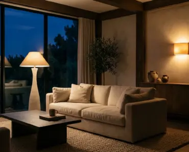
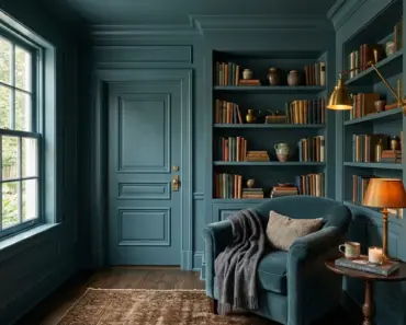
If you still crave that moody, cocooning atmosphere, try charcoal or deep navy. These shades are far more forgiving of scuffs and smudges and still give you a rich, dark backdrop. They also tend to recede less aggressively, so the room does not feel like it is shrinking around you.
Is yellow always cheerful?
Sunshine yellow is full of energy, but that is exactly why it can backfire. Brien explains that yellow tends to stimulate hunger and activity. That makes it a popular choice for kitchens and playrooms, but in a bedroom, it can keep your brain switched on instead of calming down. The same brightness that perks you up at breakfast can sabotage your sleep.
Soft buttercream or warm honey tones give you the sunny feeling without the overstimulation. These muted versions still feel optimistic and welcoming, but they let your mind wind down when the day is done.
Are neon colors too much?
Neon shades and overly bright colors like fuchsia, hot pink, bright orange, and lime green create a tremendous amount of visual energy. In a space meant for rest, that energy turns the room into a lively, loud environment when it should feel restful. These hues might work for a boutique or a party venue, but in a home they often just feel exhausting.
What makes neon colors feel dated rather than fun?
Part of the problem is their association with short-lived trends. A neon accent wall can feel fresh for one season and painfully retro the next. Softer, muted tones of those same colors—think blush instead of hot pink, sage instead of lime—still have personality but age more gracefully. If you love a punch of brightness, try it on throw pillows, a rug, or a piece of statement art. That way, swapping it out feels like a minor refresh, not a major repainting project.
Why do neutral lovers sometimes regret playing it too safe?
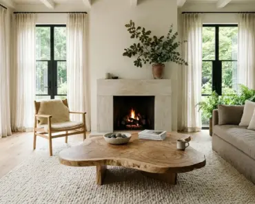
Beige, greige, and off-white seem like the safe bet. But playing it too safe can leave you with a room that feels unfinished and completely devoid of personality. The regret here is quieter than with bold colors. It creeps in slowly as you realize every room in the house looks like a rental. Without contrast or texture, safe neutrals can flatten a space and make it feel sterile rather than serene.
The fix is simple: layer your neutrals. Mix warm and cool undertones, add dimension with stone, wood, and textiles, and bring in a few deeper accents like olive or slate. That way, you get a calm, sophisticated backdrop that still feels lived in and welcoming.
You may also enjoy reading: Estimate Kitchen Floor Replacement Cost with Homewyse Calculator.
Is stark white another common regret?
Stark, brilliant white can seem like the ultimate clean canvas. In reality, it often reads as cold and clinical, especially in rooms with low natural light. Pure white reflects light harshly and can highlight every architectural flaw. Instead of a gallery-like feel, you get a space that feels unfinished and uninviting.
Warmer whites with a touch of cream or a whisper of gray create a much softer envelope. They still feel bright and open but wrap the room in a gentle warmth. Testing a few white swatches on different walls is essential because the undertones are subtle but make a huge difference.
How to Avoid Paint Color Regret From the Start
What if I already painted a room in a regretful color—can I fix it without repainting the whole space?
Yes, in many cases you can tone down a regretful color without starting from scratch. If the room feels too intense, add large neutral elements like a substantial rug, drapes, or upholstered furniture to visually break up the walls. You can also try washing the walls with a translucent lime-based paint or a color-washing technique that lets a softer undercoat show through. In extreme cases, an accent wall in a complementary neutral can rebalance the entire room.
Amazon US Verified
Peel and Stick Textured Linen Wallpaper
Removable neutral wall covering providing architectural warmth and tactile depth.
How do I test a paint color in my home before committing to a full wall?
Never trust a two-inch chip under fluorescent store lighting. Buy a sample pot and paint a large swatch—at least two feet square—on multiple walls. Observe it at different times of day, under natural and artificial light. Stand back and look at it next to your flooring, trim, and largest pieces of furniture. Colors shift dramatically with exposure and surroundings, so living with the swatch for a few days reveals what you will actually live with.
Why does a color that looks great on a swatch sometimes feel wrong once it’s on the wall?
A color chip isolates the hue from context, but walls interact with every other surface and light source in the room. Undertones that were invisible on the swatch can suddenly clash with your sofa or floors. Furthermore, the sheen of the paint changes how light bounces off it. A matte finish absorbs light and softens the color, while satin or eggshell reflects more and can make the hue appear brighter and more saturated.
Frequently Asked Questions
Which paint color do interior designers say people regret the most?
Bright red consistently tops the list. Designers Isfira Jensen and Terri Brien both point to its tendency to feel aggressive and overwhelming, especially on large surfaces. In rooms meant for relaxation, red can promote restlessness rather than calm, making it the number one regret for many homeowners.
Can dark paint colors ever work in small rooms without causing paint colors regret?
Yes, but it takes intention. Very dark shades like black or deep navy absorb light, so you need ample natural or layered artificial lighting to keep the room from feeling like a cave. Choose a paint with a slight sheen to reflect a bit of light, and balance the dark walls with light flooring, ceilings, and furnishings. In a small powder room or a study, dark colors can create a jewel-box effect that feels intentional rather than oppressive.
What is the safest paint color to choose if I want to avoid any regret?
Soft, warm neutrals with complex undertones are the safest bet. Think of a greige that sits between gray and beige, or a creamy off-white with a hint of warmth. These shades adapt to different lighting conditions and play well with a variety of decorating styles. They may not be the most exciting choice, but they rarely lead to serious paint colors regret, especially if you add visual interest through texture and accent pieces.
Paint has the power to transform a room in a single weekend, but a little caution goes a long way. Before committing to a bold hue, consider how you want to feel inside that space and whether the color you love on a swatch will serve that mood day after day. Swatch generously, watch the light, and remember that even the most regretted paint color can be corrected with a few smart styling moves or a fresh coat in a more livable shade.

Amazon US Verified
Ceramic Fluted Decorative Vase Set
Modern minimalist ceramic vases perfect for shelves, consoles, and dried florals.
As an Amazon Associate, azuloz.com earns from qualifying purchases.