
You have a small powder room, a compact home office, or an intimate guest bedroom with limited natural light. You want to inject drama and personality without making the room feel like an uninspired white drywall cube. So, you follow the advice popularized on home improvement television for the past twenty years: you paint three walls a safe off-white or light gray, and you choose one feature wall to paint in a bold, moody charcoal or deep navy.
You step back into the hallway, expecting the space to feel deep and designer-crafted. Instead, something feels awkwardly disjointed. Rather than feeling expansive, the room feels choppy, fragmented, and noticeably smaller than it did before. The dark wall aggressively advances toward you like a flat partition, while the white corners starkly outline the cramped perimeter of the floor plan.
You have fallen into the “contrast trap.” Environmental psychologists and leading architectural colorists now understand that traditional accent walls frequently backfire in compact rooms because of how human visual perception processes high-contrast boundaries. Understanding saccadic eye flow, visual weight, and the modern architectural technique of **color drenching** reveals how embracing deep color across 360 degrees can actually dissolve physical boundaries and make small rooms feel infinitely more expansive.
The Neuro-Perception of Space: Why Accent Walls “Halt the Eye”
To understand why an accent wall can shrink a small room, you have to examine how the human visual cortex maps spatial volume. When you walk into an interior space, your eyes do not take in the room as a static photograph. Your eyes perform rapid, microscopic darting movements called **saccades**, scanning edges, intersections, and changes in light luminance to calculate room height, depth, and boundary limits.
Human spatial perception relies on visual continuity. When the surfaces in a room share a low contrast ratio—such as soft, consistent tones across adjacent walls—the eye glides smoothly around the perimeter without interruption. Because your brain does not encounter hard stops, it perceives the space as fluid, cohesive, and open.
When you paint a single dark accent wall in an otherwise pale room, you introduce an extreme contrast boundary. In visual science, this creates an abrupt optical stop. As your gaze sweeps across the room, it hits the dark wall and freezes. Instead of flowing naturally around the space, the visual cortex gets trapped in the high-contrast seams where dark paint meets stark white drywall, white crown molding, and white baseboards.
These stark, high-contrast outlines act as a visual highlighter for the room’s physical constraints. Your brain immediately registers: “Here is exactly where the room ends; here is the narrow four-foot boundary of the corner.” By drawing bright white frames around a dark surface, the traditional accent wall visually dices a compact space into disjointed geometric slices.
The Physics of Advancing vs. Receding Colors
In color theory, colors with high chromatic saturation and low Light Reflectance Values (LRV)—such as rich emerald, dark aubergine, or deep slate—possess heavy visual weight. When applied in isolation against light surroundings, dark walls naturally **advance** toward the observer, making the wall appear closer than it physically is.
In a long, narrow “bowling alley” hallway or deep rectangular living room, placing a dark color on the far short wall can be beneficial because it pulls the distant wall inward, balancing room proportions. But in a square, compact bedroom, home office, or powder room, an advancing accent wall collapses the central volume, creating an optical pinch that makes the room feel crowded and claustrophobic.
The Modern Architectural Antidote: Color Drenching
Over the past five years, high-end interior architects and British colorists (such as Farrow & Ball’s creative directors) have largely abandoned the isolated accent wall in favor of a technique known as **color drenching**.
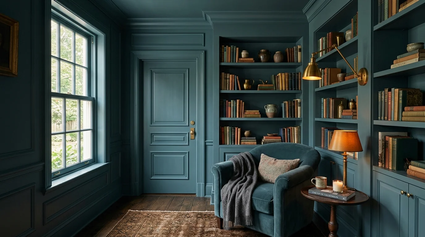
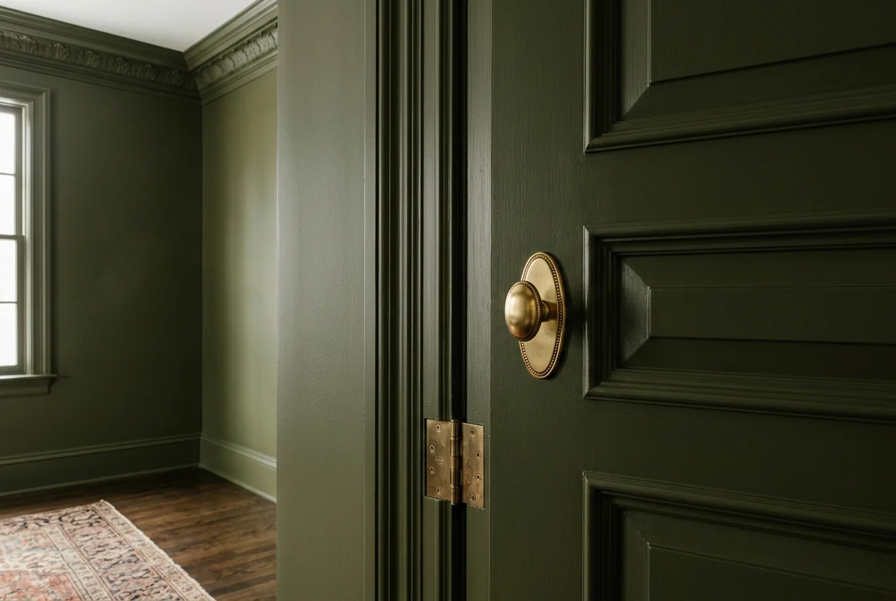
Color drenching involves painting every architectural surface in a room—the walls, the baseboards, the door casings, the doors, the radiator covers, built-in shelving, and even the ceiling—in the exact same hue. While the idea of painting a small room entirely in a deep, moody color sounds terrifying to cautious homeowners, the optical result is the exact opposite of what intuition suggests.
Here is the architectural magic of color drenching:
- Erasing the Boundary Seams: When baseboards, walls, and crown molding are all painted the exact same color, the high-contrast lines that define the room’s physical edges vanish. The eye can no longer easily identify where the wall ends and the ceiling begins. Without hard demarcation lines, the corners visually blur and recede into shadow.
- Ceiling Envelopment: Painting a ceiling white in a dark-walled room creates a jarring “lid” effect that draws the eye down to a hard horizontal line. When the ceiling is drenched in the same shade (using a flat, matte finish), it creates an expansive, sky-like infinity effect that makes modest ceilings feel higher.
- Total Visual Immersion: Instead of feeling like a cramped box with one oddly painted surface, a color-drenched room feels intentional, confident, and enveloping. It transforms a cramped footprint into an intimate, luxurious jewelry box.
The 3-Sheen Formula: Creating Depth Without Contrast
A color-drenched room should never look like a flat plastic tub. The secret to professional color drenching lies in using varying **paint sheens** of the exact same color formula to capture and play with ambient light:
1. Walls: Eggshell or Matte
Paint main wall expanses in a velvety matte or premium eggshell finish. A low-sheen paint absorbs direct glare and softens shadow lines, allowing rich undertones (such as deep olive greens or smoky blues) to feel soft and tactile.
2. Trim, Moldings, and Doors: Satin or Semi-Gloss
Coat all wood trim, wainscoting, interior doors, and baseboards in satin or semi-gloss using the exact same paint color. Because wood surfaces have a higher sheen than matte drywall, they catch ambient light from windows and lamps with subtle, architectural highlights. This creates elegant structural definition without introducing disruptive color contrast.
3. Ceilings: Dead Flat
Use a completely dead-flat ceiling paint in the same color. Flat paint eliminates specular reflections and light pooling from chandeliers or table lamps, allowing the ceiling plane to recede seamlessly into the upper atmosphere of the room.
Choosing the Right Color Temperature and Lighting
If you choose to color-drench a compact room, pair your paint selection with intentional lighting:
- Embrace Warm Undertones: Avoid cold, sterile grays with blue undertones. Opt for enveloping nature-inspired shades: rich forest moss, deep terracotta, warm tobacco brown, midnight slate, or deep aubergine.
- Layer Warm Ambient Illumination: Color-drenched rooms come alive after dark. Eliminate harsh overhead fluorescent or daylight bulbs (5000K). Install warm-white accent lamps, brass picture lights, and wall sconces fitted with 2700K warm-spectrum bulbs. Warm light bounces gently off satiny trim, creating a golden, candlelit glow.
- Add Reflective Accents: Introduce unlacquered brass hardware, warm wood furniture, and beveled glass mirrors. The high-contrast reflections from brass and polished wood pop with dramatic elegance against monochromatic walls.
📥 Free Download: Color Drenching & Spatial Depth Formula
The 3-sheen monochromatic paint formula, saccadic eye flow principles, and undertone guidelines for small spaces.
Summary: Confidence Over Timidity in Small Spaces
A small room will never feel like a sprawling ballroom, and pretending it is one by painting it clinical white with a timid accent wall only highlights its limitations. By leaning into the architectural intimacy of color drenching, you eliminate visual friction, blur boundaries, and create a sophisticated, cozy retreat that feels grand in spirit, comfort, and design.