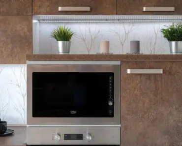
Choosing a paint color for the heart of your home is a big decision. One wrong move, and your cozy kitchen starts feeling claustrophobic. Understanding which colors make kitchen smaller can save you from a costly mistake. Below, we break down five popular yet problematic shades and offer simple swaps that keep your kitchen feeling open and inviting.

The Core Principle: How Dark Colors Steal Your Space
Before diving into specific hues, it helps to understand why certain colors shrink a room. The primary culprit is light absorption. Dark pigments absorb a higher percentage of the light that hits them, lowering the overall brightness of the room. When a space feels dark, the brain struggles to define its boundaries. Walls seem to close in, and the ceiling feels lower. Color temperature also plays a role. Deep warm tones can feel oppressive, while deep cool tones can feel cold and cavernous. Learning which colors make kitchen smaller is essentially about learning which colors eat up your light.
The Role of Light Reflectance Value (LRV)
Every paint color has an LRV rating, measured from 0 (absolute black, absorbing all light) to 100 (pure white, reflecting all light). Colors that fall below 30 on the LRV scale are considered low-reflectance. For a small kitchen, you generally want an LRV of 60 or higher. The five colors we discuss here often hover in the low teens or twenties. This single number explains why they can visually compress your cooking space.
Navy Blue: A Contrast Trap for Tight Kitchens
Navy blue enjoys widespread popularity for its classic, nautical appeal. It pairs beautifully with gold hardware and white subway tile. But this hue has a hidden downside for smaller kitchens. The intense contrast between deep navy walls and light cabinetry creates a fragmented, choppy look. Instead of flowing, the space feels broken into competing blocks of color.
Why the contrast backfires
International color specialist Amy Wax explains that navy contrast can be overwhelming in a tight room. The eye jumps between the dark wall and the light cabinet, never finding a restful point. This visual tension makes the space feel distracting rather than relaxing. In a galley kitchen, this effect narrows the perceived width of the walkway.
Testing the impact at home
If you are drawn to navy, try a simple test. Paint a large piece of white foam board with your chosen navy shade. Prop it up against the wall and live with it for a few days. Notice how the room feels during the day versus at night. This test reveals how the color interacts with your specific lighting before you commit to a full paint job.
A softer blue alternative
You do not have to abandon blue entirely. Wax suggests swapping navy for a lighter slate blue or a blue-gray. These colors offer the same calming presence without the extreme contrast. They reflect more light and allow the cabinets to blend harmoniously. The room stays sophisticated without feeling boxed in.
Charcoal Gray: The Neutral That Eats Light
Charcoal gray reads as modern, grounded, and incredibly sleek. It is a popular choice for minimalist kitchens. However, in small spaces, this dark neutral acts like a vacuum for natural light. A room painted charcoal can feel cave-like, especially if it lacks ample windows or strong artificial lighting.
The problem with low-LRV neutrals
A true charcoal paint typically has an LRV between 10 and 20. This means it absorbs roughly 80 to 90 percent of the light that hits the surface. In a kitchen that measures 10 by 10 feet, this drastically reduces the ambient brightness. The corners of the room disappear into shadow, and the overall volume of the space feels compressed.
How charcoal affects a windowless kitchen
Think about a kitchenette with only a single small window or no window at all. Charcoal gray walls will transform that room into a dark box. Even with overhead lighting, the walls soak up the illumination. You end up feeling like you are cooking in a small, enclosed cave rather than an open living area.
Lighter neutrals that expand the room
Wax recommends looking at lighter neutrals that still carry a weighty presence. Beiges, rich caramels, warm tans, and cool grays with a higher LRV are excellent choices. These shades provide the same sturdy, grounded feeling as charcoal but bounce light around the room. They define the walls without shrinking them.
Forest Green: Drama Without Natural Light
Deep forest and emerald greens bring a luxurious, nature-inspired mood to a kitchen. They evoke the feeling of a tranquil woodland. But this drama comes at a cost. Interior designer Eddie Maestri notes that these deeper greens can weigh down a space that lacks natural light and breathing room.
The suffocating effect of dark green
Imagine a kitchen with one window facing north. Painting the walls forest green means every photon of available light gets absorbed. The room feels stuffy and heavy. Instead of feeling like a serene retreat, it feels like a dim, enclosed booth. The green overwhelms the senses rather than calming them.
Muted sage as a graceful alternative
You can keep the earthy connection to green without sacrificing visual space. Maestri suggests muted sages like Farrow & Ball Mizzle or Sherwin-Williams Sea Salt. These shades feel grounded and serene. They maintain a soft connection to nature without dragging the room into darkness. Wax adds that blue-greens or soft sage tones reflect more light while still providing color depth.
The accent wall compromise
If you absolutely love deep green, consider using it on a single accent wall. Choose the wall behind the stove or the sink. Paint the remaining three walls a light sage or creamy white. This strategy gives you the drama of green in a controlled dose. It creates a focal point without making the entire room feel smaller.
Dark Red: Ruby Tones That Push Walls Inward
Red is a passionate, energetic color. It warms up a room instantly. But dark shades of red, like ruby, scarlet, and burgundy, have a peculiar optical effect. They make the walls appear closer together than they actually are. This phenomenon shrinks the room from every angle.
You may also enjoy reading: Inside 7 Cannes Hotel Suites Backstage.
The visual compression of dark red
Wax explains that deep reds advance visually. This means the wall surface feels like it is moving toward you. In a small kitchen, this creates a tunnel-like sensation. The space feels narrower and more confined. This is especially problematic in U-shaped kitchens where you already have walls on three sides.
Alternatives for the bold at heart
You do not have to give up on red entirely. Wax recommends switching to earthier reds like rust or terra cotta. These shades carry the warmth and energy of red but feel lighter and more organic. They add character without the shrinking effect. If you want a softer touch, a salmon pink or creamy white can add grace and charm to the room.
Deep Slate: The Sophisticated Space Intruder
Deep slate is a favorite for creating tuxedo-style kitchens, where lower cabinets are dark and upper cabinets are light. It is an elegant, high-end look. But in a compact footprint, slate can be a serious problem. The inky tone absorbs light from the lower half of the room, creating a visual hole that disrupts the flow.
How slate breaks visual continuity
When your lower cabinets are deep slate, they absorb light and stop the eye. The room feels bottom heavy and segmented. Instead of a cohesive open area, the kitchen feels like two separate zones. This chopped-up perception makes the space register as smaller in your mind.
The practical impact on tight spaces
In a narrow galley kitchen, deep slate cabinets or walls make the room feel like a tight corridor. The shadows accumulate near the floor, making the walkway feel narrower. This can make the kitchen feel uninviting and cramped, especially when multiple people are trying to cook or move around.
A warm greige alternative
Wax suggests swapping deep slate for a soft warm greige, such as Benjamin Moore Revere Pewter. This color offers the depth and sophistication of slate without the light-sucking properties. Greige reflects more light while still providing a solid, grounded presence. It adds texture and dimension to the room without darkening the space.
Practical Steps to Avoid a Paint Mistake
Now that you know which colors to approach with caution, here are a few actionable steps to ensure your final choice works in your specific kitchen.
Always test large swatches
Never rely on a tiny paint chip from the hardware store. Purchase a sample quart of your chosen color. Paint a large section of poster board or foam core at least two feet by two feet. Place it against different walls in your kitchen. Observe it in the morning, afternoon, and evening. Light changes throughout the day, and your color will too.
Consider your lighting temperature
Your bulbs matter just as much as your paint. Warm light (2700K to 3000K) can make dark colors feel heavy and yellow. Cool light (4000K to 5000K) can make them feel stark. For small kitchens with dark paint, use high-CRI bulbs (90 or above) to ensure the color looks true. Under-cabinet lighting is also a lifesaver for opening up dark lower sections.
Count your natural light sources
Before choosing a dark color, assess your windows. North-facing rooms receive cool, indirect light that makes shadows deeper. South-facing rooms get warm, direct light that can handle darker paint better. If you have only one window, stick to lighter versions of the colors you love. If you have multiple windows or a skylight, you can safely go one shade darker.
The Final Takeaway on Color and Space
Choosing a dark paint color for your kitchen is not an automatic mistake. The key is understanding your home’s specific conditions. A color that looks stunning in a magazine may fall flat in your specific footprint. Before you buy a gallon, test a large swatch and live with it for a few days. You might find that a softer version of your favorite hue gives you the mood you want without the cramped consequence. Whether you are a first-time homeowner or an experienced renovator, learning which colors make kitchen smaller is a reliable way to keep your space feeling open, bright, and truly inviting.