Stairs Drawing: A Simple, Realistic Step-by-Step Guide
Learn perspective, spacing, and finish details so your steps look even, solid, and easy to read.
How do you create a stairs drawing that looks “right” at a glance—without guessing step spacing or fighting perspective?
A strong stairs drawing is not about fancy tools. It’s about a clear plan: build a simple stair “box,” split it into even steps, then add a few details that sell depth. Once you learn that loop, you can draw stairs for home ideas, school art, comics, woodworking notes, or renovation planning.
This guide stays easy to read on purpose. I’ll use short steps, plain words, and quick checks that catch the common problems. You’ll also get a freshness layer—what people do now that works better than older “draw and erase forever” advice.
If you publish on famliynest.com, you can also lift pieces of this post into smaller tutorials: “one-point stairs,” “L-shaped stairs,” “isometric stairs,” and “stairs shading.”
Quick update:
A lot of stair drawings look off because the artist changes the “rules” mid-sketch. They start in one-point perspective, then drift into two-point without noticing. Pick one system, set your guides, and keep them until the end.
Comment question: Do you set guides first, or do you start freehand and fix it later?
1) The stair basics that make your drawing believable
Start with a simple idea: stairs are a repeating pattern of two shapes. You have a flat surface you step on, and a vertical face that lifts you to the next level. If you keep those shapes consistent, your stairs drawing will feel stable.
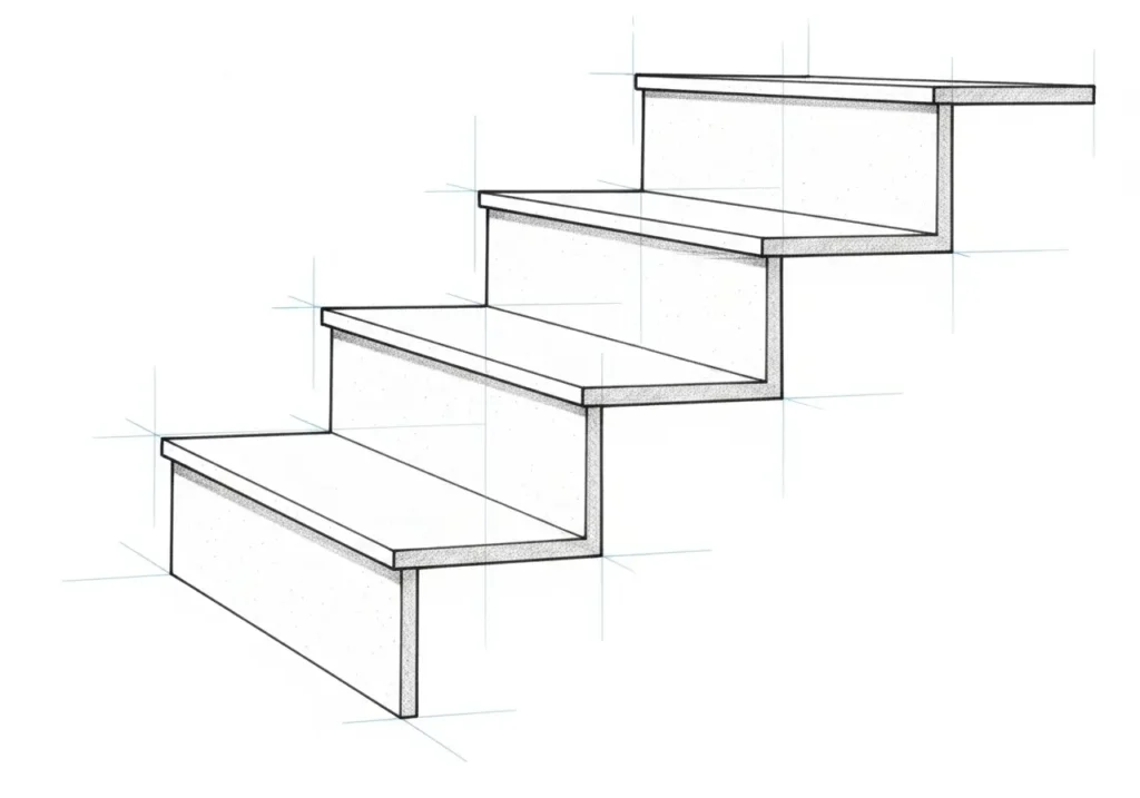
Here are the terms you’ll see in tutorials and DIY notes:
- Tread: the flat “step” surface.
- Riser: the vertical face between treads.
- Nosing: the front edge of a tread (it may stick out a bit).
- Rise: how tall each step is (vertical change).
- Run: how deep each step is (front-to-back change).
- Landing: a flat pause area at the top, bottom, or a turn.
- Flight: a continuous run of steps with no landing break.
Two goals, two drawing styles: When people search “stairs drawing,” they often want either (1) a realistic 3D look, or (2) a clear plan-style sketch that communicates layout. You can do both, but you should decide which job comes first. A good plan sketch can look simple and still be “correct.” A good 3D sketch can cheat and still feel real.
The secret rule: Your viewer forgives a lot, but they do not forgive uneven steps. If the first step looks tall and the next looks short, the whole drawing feels wrong. So we build a system for even spacing first, then we add style.
Quick reflection: When you picture stairs that look “wrong,” what stands out first—uneven step height, odd angle, or missing shadows?
Mini example (home sketch): If you draw a basement stair for family planning, you want clarity. Use a simple side view with labeled step count and a landing. If you draw the same stair for a comic scene, you want mood. Use a low viewpoint, strong shadow shapes, and fewer lines.
Discussion question: Are you drawing stairs to explain a layout, or to create a scene and feeling?
2) What’s new: modern best practices (and outdated advice to skip)
Older drawing advice often pushes one path: draw a ton of guide lines, then erase until you find your final shape. That can work, but it creates two common problems. First, you burn time. Second, you lose consistency when you erase and redraw the same edges again and again.
Here’s what works better now, whether you draw on paper or on a tablet.
Big shifts you can use right away
- Fewer guides, better checkpoints: Instead of drawing every possible line, you set one “stair box,” then you use spacing marks to keep each step even.
- Line hierarchy matters more than detail: A bold outer edge plus lighter inner lines can look more “real” than heavy shading everywhere.
- Digital drawing rewards discipline: Snapping and grids help, but over-zooming can hide problems. Zoom out often so you see the whole staircase.
- Readers want usefulness: Many people now want drawings that teach. Labels, arrows, and small plan views help your audience follow along.
Outdated mistakes that waste effort
- Outdated: “Eyeball the spacing and fix it with shading.” New: Fix spacing first. Shading should support structure, not hide problems.
- Outdated: “Pick any vanishing point.” New: Place vanishing points with intent. Far apart looks calm. Close together looks dramatic but can distort.
- Outdated: “Add railings last.” New: Block rails early if the stair must look usable. Rails give scale and often reveal if stairs feel too narrow.
A simple freshness rule: Design your tutorial to work on mobile. That means clean headings, short steps, and drawings that look good at a small size. If your final sketch only looks good when zoomed in, most readers won’t feel confident copying it.
Discussion question: Do you want your stairs drawing to look realistic up close, or to read clearly from across the room?
Common headline myth:
“You need advanced math to draw stairs.” You don’t. You need equal divisions and straight projections. Once you can split one edge into equal parts, you can draw steps that look even.
Comment question: What part feels like “math” to you—vanishing points, spacing, or angles?
3) Choose your view: realistic 3D vs diagram (and why it matters)
If you ever felt stuck, you may have picked the wrong view for your goal. The view you choose controls how much work you need to do. It also controls what your viewer understands in two seconds.
Three “best” views for stairs
- Front/straight-on 3D view: great for simple one-point perspective stairs. It looks clean and reads fast.
- Corner/angled 3D view: great for two-point perspective stairs. Use it for entryways, hallways, and scenes with walls.
- Diagram view (isometric or plan): best for teaching, DIY planning, and printable guides.
The “stair box” concept (your best friend)
Imagine your staircase sits inside a simple box. The top of the box is the upper floor. The bottom is the lower floor. The depth is the space the stairs need to travel forward. Once you can draw the box, the steps become a repeat pattern inside it.
This idea helps in every style:
- In one-point perspective, the box guides your depth lines.
- In two-point perspective, the box locks your angles to both vanishing points.
- In isometric, the box keeps height and depth tidy.
- In plan view, the box becomes a footprint you can label.
A quick “scale check” that many tutorials skip
Even a simple stairs drawing feels more real when you add one scale clue. You can draw a shoe shape on a tread, a doorknob on a wall near the stairs, or a person silhouette in the background. You don’t need detail. You need context.
Mini example (real room sketch): Draw a stair flight beside a wall. Add a baseboard line. Add one light switch plate shape. Suddenly your stairs sit in a home, not in empty space.
Quick reflection: If someone saw your drawing for one second, what should they understand first—the direction “up,” the number of steps, or the mood of the scene?
Discussion question: Which view do you enjoy drawing most: straight-on, corner view, or diagram style?
4) One-point perspective stairs (the easiest realistic method)
If you want the smoothest path to a realistic stairs drawing, start here. One-point perspective works well when you face the stairs and the main depth lines move away from you in one direction.
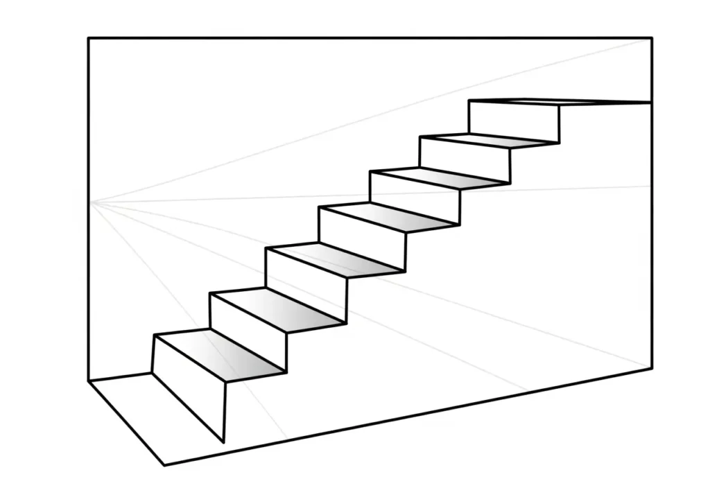
What you’ll set up
- Horizon line: your eye level.
- One vanishing point: where depth lines aim.
- Stair box: a rectangle that becomes a 3D space.
- Spacing marks: equal divisions for step heights.
Step-by-step: draw one-point stairs from scratch
- Draw a horizon line across your page.
- Place one vanishing point on that line (near the center is easiest).
- Draw a tall front rectangle. This is the front face of your stair box.
- From the top corners of that rectangle, draw light guide lines to the vanishing point.
- From the bottom corners, do the same. You now have a “tunnel” shape for depth.
- Decide your step count (example: 10 steps).
- On the front vertical edge, mark 10 equal divisions. These are riser heights.
- From each division mark, draw a light line back to the vanishing point.
- Now build the steps: draw a short horizontal tread line, then a vertical riser line, repeating until you reach the back guide.
- Erase or lighten guide lines. Darken the final edges you want to show.
Two fast checks that prevent “weird stairs”
- Check 1 (even rise): Do the riser faces look the same height on the front edge? If not, fix your division marks.
- Check 2 (clean depth): Do all depth edges aim to the same vanishing point? If one drifts, the stairs will twist.
Make the stairs feel real with one tiny change
Add a landing at the top. Even if you keep it small, a landing gives your stairs a clear “destination.” It also gives you a flat plane to shade, which helps depth.
Mini case study (school art project): You need a hallway scene with stairs. Use one-point perspective with the vanishing point in the center. Keep the stairs on one side. Add door frames on the walls that also aim to the same point. Your whole scene becomes coherent.
Discussion question: When you draw one-point stairs, do you prefer looking up from the bottom or looking down from the top?
5) Two-point perspective stairs (for corners, rooms, and drama)
Two-point perspective shines when you see a staircase from an angle. You can show the side of the steps and the face of a wall at the same time. This is great for entryways, living rooms, and exterior deck steps.
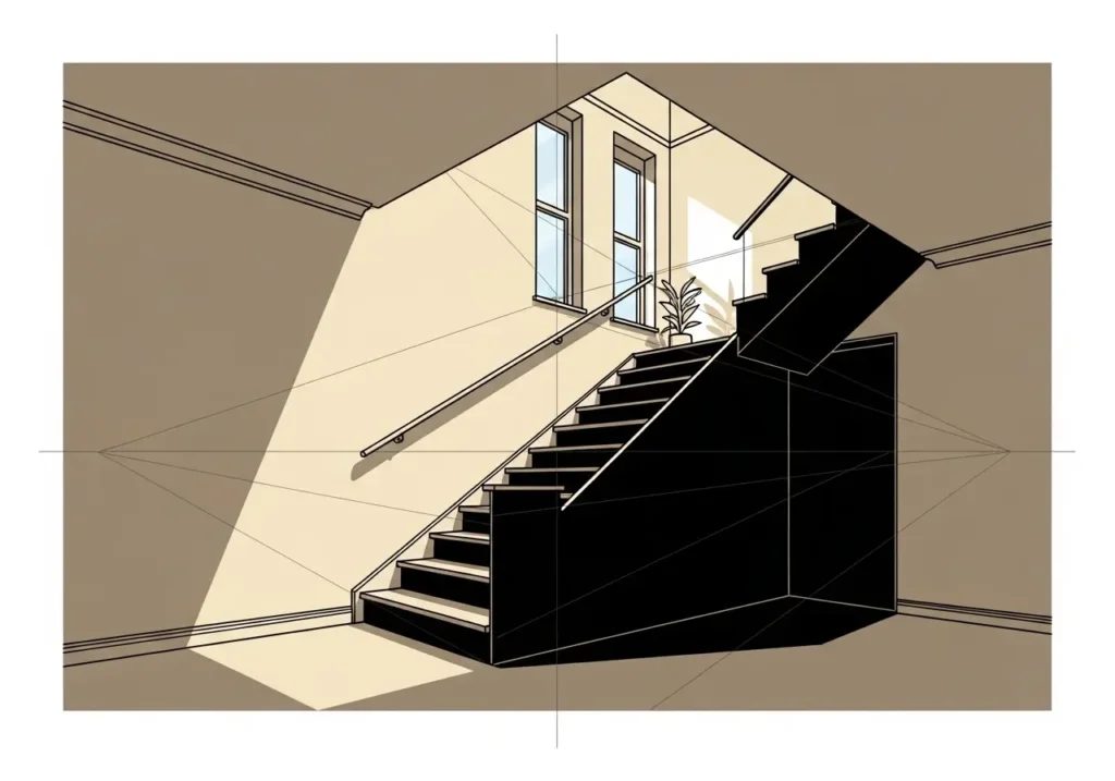
When two-point is worth the effort
- You want the stairs to feel like they sit inside a real room.
- You plan to draw rails, walls, posts, or furniture near the stairs.
- You want a dramatic angle without a fisheye look.
Step-by-step: two-point stairs with less confusion
- Draw your horizon line.
- Place two vanishing points far apart on the horizon. Far apart gives a calmer look.
- Draw one vertical line for the nearest front corner of the stair box.
- From the top and bottom of that line, draw guides to both vanishing points.
- Decide the box width and depth by adding vertical edges inside the guides.
- Pick a step count. Mark equal riser divisions on the nearest vertical edge.
- Project those division marks toward the correct vanishing point to create consistent step planes.
- Draw the tread edges across the top plane, then drop riser faces down from those edges.
- Clean up: darken the edges you want, lighten the rest.
The “rail test” (a realism trick)
In many scenes, the rail makes the stairs feel real faster than extra step lines. Add a rail line that follows the slope of the stair. Then add posts at the bottom, at the turn, and at the top. If the rail looks like it floats, your step planes may not line up.
Mini case study (front porch steps): You want to sketch a porch with steps and a small landing. Two-point perspective helps because the porch and the steps share angles. Draw the porch box first. Then carve steps into the front edge. Add one shadow under the porch lip and your sketch pops.
Discussion question: Do you like two-point because it feels realistic, or do you find it stressful because of the extra lines?
Trend watch:
More creators now teach stairs with “shape first, detail last.” The best tutorials show the stair box, then step divisions, then shadows. That order builds confidence because you see progress at each stage.
Comment question: Do you prefer tutorials that start with a finished example, or ones that start with a blank page?
6) Isometric stairs drawing (clean diagrams that teach fast)
Isometric drawings feel “technical,” but you can learn them with simple repetition. Many readers love isometric stairs because they look clear in blog posts and printables. They also help DIY planning because the shape stays consistent and easy to measure.
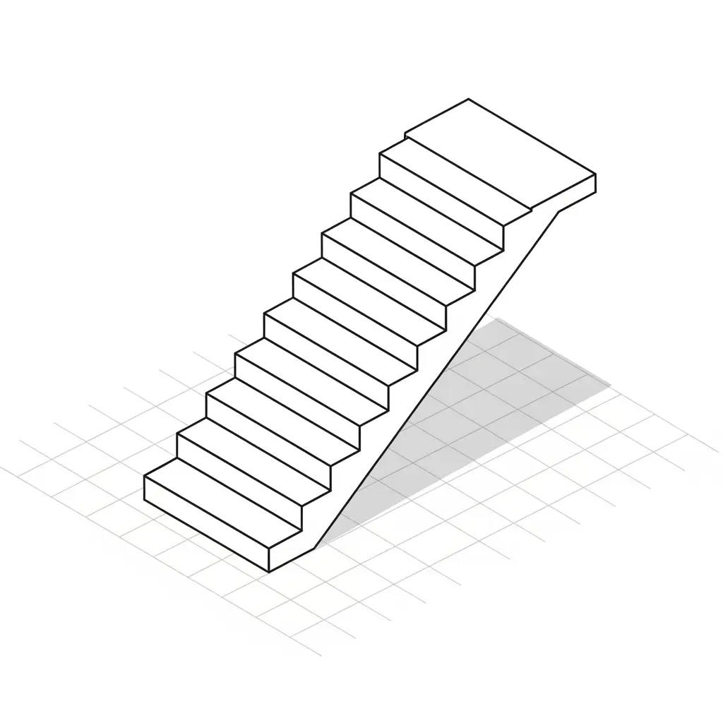
What makes isometric different
- Lines do not aim at vanishing points.
- Parallel edges stay parallel.
- It reads like a clean diagram, not a camera photo.
Step-by-step: isometric stairs in one repeatable recipe
- Start with an isometric grid (or draw two slanted directions plus vertical lines).
- Draw a 3D box for the staircase volume.
- On the side face, divide the height into equal riser steps.
- On the top face, divide the depth into equal tread sections.
- Connect the points to form the step pattern.
- Darken the outer silhouette and the top edges.
- Add one shadow plane on the underside for depth.
Make isometric stairs feel less “cold”
Many isometric drawings look stiff because every line has the same weight. Fix that with line hierarchy. Use a darker stroke on the outer edge. Use a medium stroke for front step edges. Use a lighter stroke for inner lines that do not matter as much.
Mini case study (blog graphic): You want a simple stairs drawing for a printable home checklist. Use isometric. Label “top landing,” “handrail,” and “direction up.” Add one arrow. Your reader understands it in seconds.
Discussion question: Would your audience rather see a realistic drawing or a clean diagram that explains the idea faster?
Related Post: How to Draw a Cat: A Simple Step-by-Step Guide for Beginners
7) Plan view + side view stairs (for DIY notes and home planning)
Not every stairs drawing needs perspective. If you plan a remodel, map a basement finish, or explain an idea to a contractor, a plan view and side view can beat a pretty 3D sketch. They speak the language of layout.
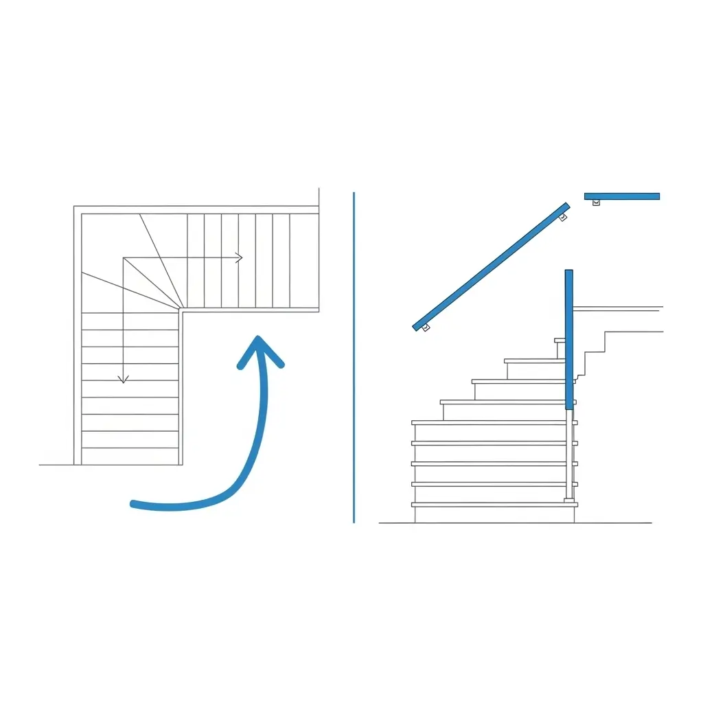
Plan view (top view): a simple way to communicate layout
- Draw a rectangle for the stair footprint.
- Draw a line for the wall beside the stairs, if there is one.
- Add parallel tread lines across the footprint.
- Draw a landing as a blank rectangle (no tread lines on it).
- Add an arrow that shows “UP” direction.
Tip: In plan view, clarity beats detail. Use fewer lines. Label the landing. Label the turn direction if the stairs turn.
Side view (elevation): show the climb in one glance
- Draw the lower floor line and the upper floor line.
- Pick a number of risers (your step count).
- Divide the total height into equal parts.
- Draw the tread lines as repeats, keeping depth consistent.
- Add a simple handrail line to show how a person would use the stairs.
A clean “communication layer” many people forget
- Write the step count: “12 steps.”
- Label the landing: “Landing.”
- Add a note for direction: “Up to main floor.”
- Mark the turn: “Turn left.”
Mini case study (family decision): You want to see if a stair turn eats too much living space. Draw a plan view with furniture boxes. Even rough boxes reveal the truth. If the stair opening pushes your sofa into a walkway, you’ll see it at once.
Quick reflection: If you showed your drawing to someone else, what question would they ask first?
Discussion question: When you think “stairs drawing,” do you picture a 3D sketch or a plan-style layout?
New vs old approach:
Old: draw every step edge with the same dark line. New: use a bold silhouette, medium main edges, and light inner lines. The stairs look cleaner on mobile and print better.
Comment question: Do you want your drawings to look sketchy and soft, or crisp and graphic?
8) Draw real stair types + finish details (landings, turns, rails, shadows)
This section turns your basic stairs drawing into something you can use in real life. You’ll learn how to draw common stair layouts, then how to add rails, light, and texture without overworking the page.
A) Straight flight stairs (the most common)
Use one-point perspective if you face the stairs. Use two-point if you view them from a corner. Keep step spacing consistent. Add a landing at the top and bottom if you want the scene to feel like a real home.
B) L-shaped stairs (quarter turn)
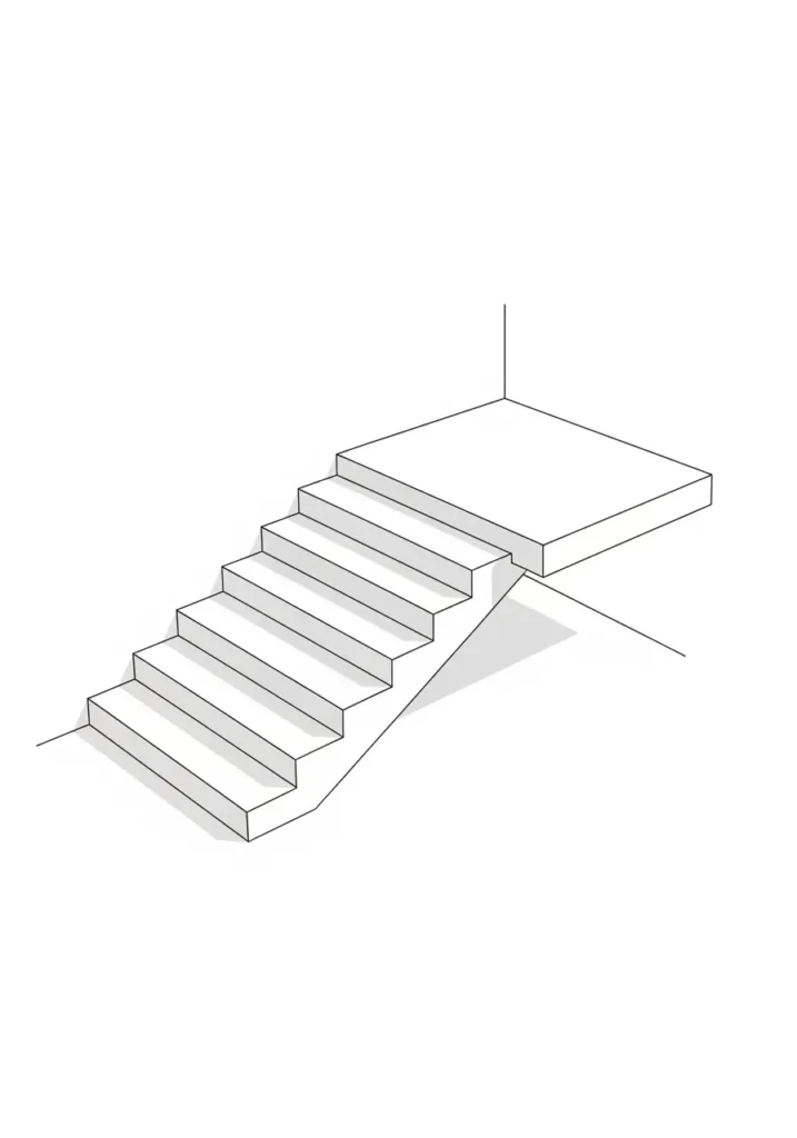
- Draw the first flight inside a stair box.
- Add a landing at the turn. Keep it flat and clear.
- Start the second flight from the landing edge, turned 90 degrees.
- Keep the riser spacing the same in both flights.
Why landings help: They reduce confusion. They also give your eye a rest, which makes the drawing easier to read.
C) U-shaped stairs (half turn)
Draw a flight, draw a landing, then return the second flight in the opposite direction. Leave a small “well” gap in the middle if you want it to feel like a common home stairwell.
D) Winder turns (steps that fan around a corner)
Winders can look great, but they can also look messy in drawings. If your goal is clarity, use a landing. If your goal is style, winders can add movement. Keep the “walk line” area (the part where feet would land) consistent and avoid sharp triangle steps that look unsafe.
E) Spiral stairs (a simple pattern method)
Spiral stairs look hard, but you can simplify them. Start with a circle for the outer edge and a smaller circle for the center column. Slice the circle like pizza into equal angles. Those slices become treads. In a 3D sketch, stack the slices up with a gentle rise and keep the outer edge consistent.
F) Exterior steps (porches, decks, garden stairs)
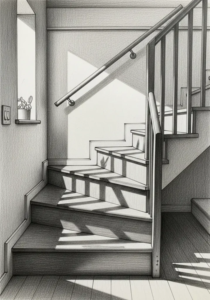
Exterior steps look more real when you show their environment. Add a ground line. Add a post. Add a simple shadow on the ground. If you draw deck stairs, show the deck thickness as a box so the stairs feel attached, not floating.
Railings: the fast realism layer
- Draw the handrail as one confident line that follows the stair slope.
- Add posts at key points: bottom, landing, top.
- Suggest balusters with a few consistent strokes, not a hundred lines.
- Keep the rail thickness consistent so it does not wobble.
Shadows: a clean rule that works in most scenes
- Pick one light direction (top-left or top-right).
- Shade the underside of each tread darker than the riser face.
- Repeat the same shadow shape on each step so the pattern looks even.
- Add one cast shadow on a wall or floor to show space and distance.
Texture: do less than you think
- Wood: a few grain lines per tread, plus clean edge lines.
- Carpet: softer shading, fewer sharp edges.
- Concrete: light speckle and strong shadow shapes.
- Tile: only a few grout lines, kept consistent with your perspective.
Troubleshooting: the most common stairs drawing mistakes (and fixes)
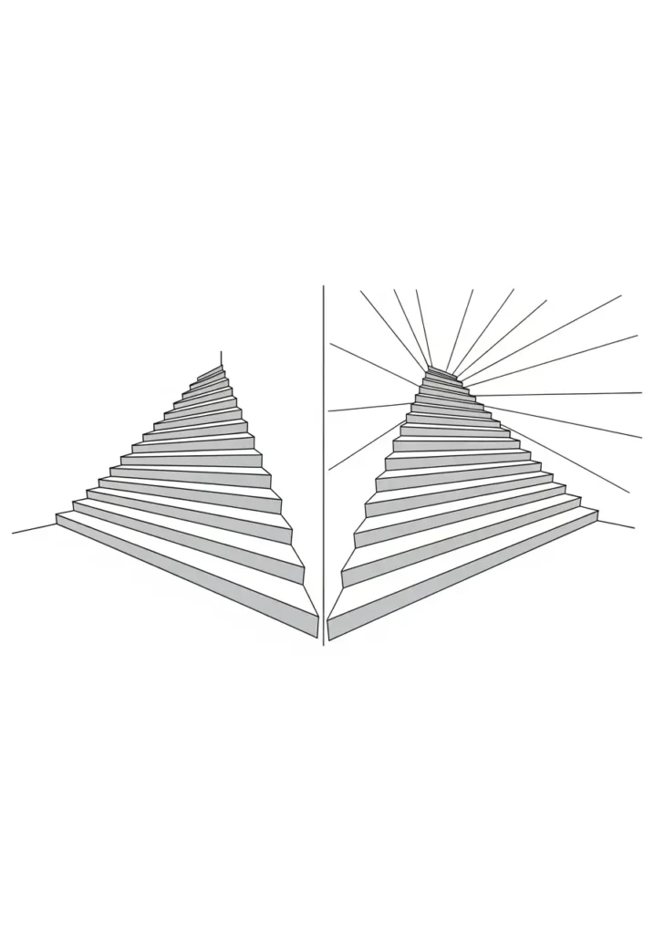
- Uneven step height: redo your equal divisions on the first edge; don’t “fix” it with shading.
- Steps look like a ramp: increase the rise relative to the run in your sketch, or shorten the depth.
- Too steep: add a landing, or increase tread depth in your design.
- Twisting stairs: check that all depth lines aim to the correct vanishing point.
- Messy look: simplify, then use line hierarchy to guide the eye.
- Flat look: add one clear cast shadow plane and one scale clue (shoe, person, door).
Practice plan (15 minutes, no stress): Draw three stair boxes. Fill one with 6 steps, one with 10 steps, and one with 14 steps. Keep them even. Then add one shadow rule across all three. This drill trains spacing fast.
Discussion question: Which finish detail changes your drawing the most—rails, shadows, or texture?
Key Takeaways:
- ✓Build a stair box first, then divide it into even steps. Spacing makes or breaks a stairs drawing.
- ✓Use one-point for the easiest realism, two-point for corners, and isometric for clean diagrams.
- ✓Add landings early when you draw turns. Landings improve clarity and reduce errors.
- ✓Use line hierarchy and one consistent shadow rule before adding texture.
- ✓If something looks wrong, fix structure first. Details should support the form, not hide it.
Frequently Asked Questions
What is the easiest way to start a stairs drawing?
Start with one-point perspective and a stair box. Mark equal divisions for step height on the nearest vertical edge. Project those marks back to your vanishing point. Build steps with a repeat pattern: tread line, riser line, tread line, riser line.
Why do my stairs look uneven?
Uneven stairs almost always come from uneven spacing marks. Redo your divisions on the first edge you measure. Then use straight projection lines for depth. Fix spacing before you shade or add texture.
Should I use one-point or two-point perspective for stairs?
Use one-point when you face the stairs and depth moves away from you in one direction. Use two-point when you see the stairs from a corner and you want both sides to recede. If you want a clean teaching diagram, use isometric instead of perspective.
How do I draw stairs turning a corner?
Use a landing. Draw the first flight, add a flat landing rectangle, then build the second flight from the landing edge. Keep step height consistent across both flights. If you try winders too early, the corner can get messy.
How do I make my stairs drawing look realistic without heavy shading?
Use line hierarchy first: bold silhouette, medium main edges, light inner lines. Then add one consistent shadow under each tread. Add one cast shadow on the wall or floor and one scale clue, like a shoe shape or a simple person silhouette.
Final Thoughts
Your best stairs drawing comes from a simple loop: box first, even spacing, then finish details. Pick the view that matches your goal, and keep one set of rules from start to finish. If you want fast progress, practice short drills that focus on spacing and clean edges, not perfect shading.
What part of drawing stairs feels hardest for you right now—spacing, perspective, or making them feel real with light?
Share your thoughts and experiences in the comments below—I’d love to hear your perspective!
