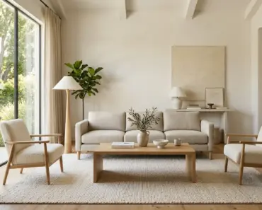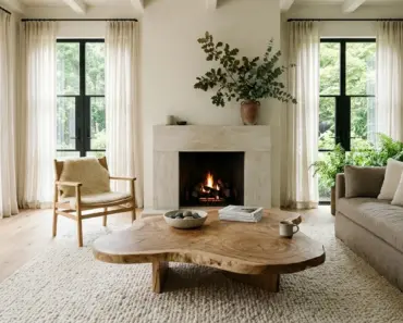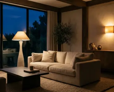

Are you currently standing in the middle of your living room, staring at a beautifully furnished space that still somehow feels incredibly incomplete and unfinished? You have chosen the perfect sofa, a gorgeous area rug, and carefully curated artwork, but the walls feel shockingly bare and uninviting. You know you desperately need window treatments to soften the space, but the sheer volume of fabric choices is completely overwhelming.
Have you ever spent hours endlessly scrolling through glossy home decor feeds, deeply wondering why their rooms look so perfectly curated while your own attempts fall flat? Choosing the wrong window treatments can instantly drag down an otherwise beautiful room. The wrong shade can make a space feel heavy, dark, or entirely disjointed. It is incredibly frustrating to invest precious time and money into a room makeover, only to have the final result miss the mark entirely because of a single mismatched fabric choice.
What if you could effortlessly tie your entire room together, elevate your interior design, and completely transform the mood of your home with one single, highly strategic decision? The secret lies entirely in understanding how to perfectly pair your wall shades with your window treatments. Welcome to your ultimate chic curtain color ideas list. Let us dive deeply into how thoughtful, highly intentional choices can instantly bring a breathtaking level of sophistication, warmth, and polish to your everyday living spaces.
The Impact of Curtain Color: More Than Just Fabric
Before we jump into our comprehensive list of color pairings, we must briefly explore why this particular decor decision carries so much massive weight. Selecting curtains is not just about picking a pretty fabric that catches your eye in the store. The specific color you choose interacts dynamically with natural light, spatial perception, and every other design element in your room in incredibly powerful ways. Your curtains serve as the vital vertical anchor for your entire design scheme.
Setting the Room’s Atmosphere
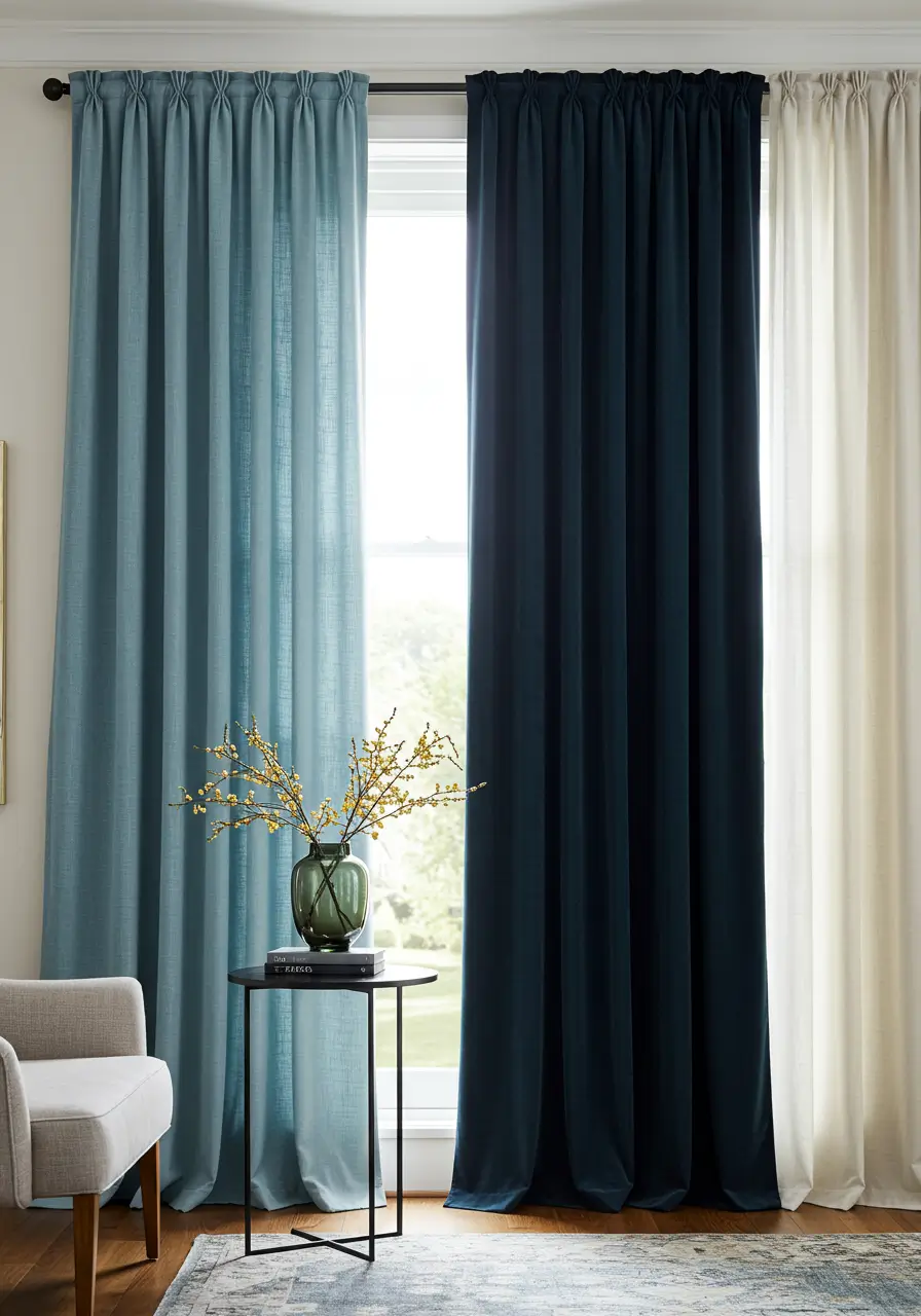
Color is a highly potent mood setter. Light and airy shades can successfully create a profound sense of calm and spaciousness. This makes them absolutely perfect for a relaxing primary bedroom or a sun filled family living area. Think about soft powdery blues, gentle dove greys, or rich creamy whites. On the opposite end of the spectrum, deep and rich colors like dramatic navy, opulent emerald, or moody charcoal can instantly introduce a strong feeling of luxury and cozy intimacy. These deeper tones are incredibly ideal for a formal dining room or a snug evening den. The shade you deliberately select becomes a massively significant part of the room’s overall emotional canvas.
Working with Light and Space Perception
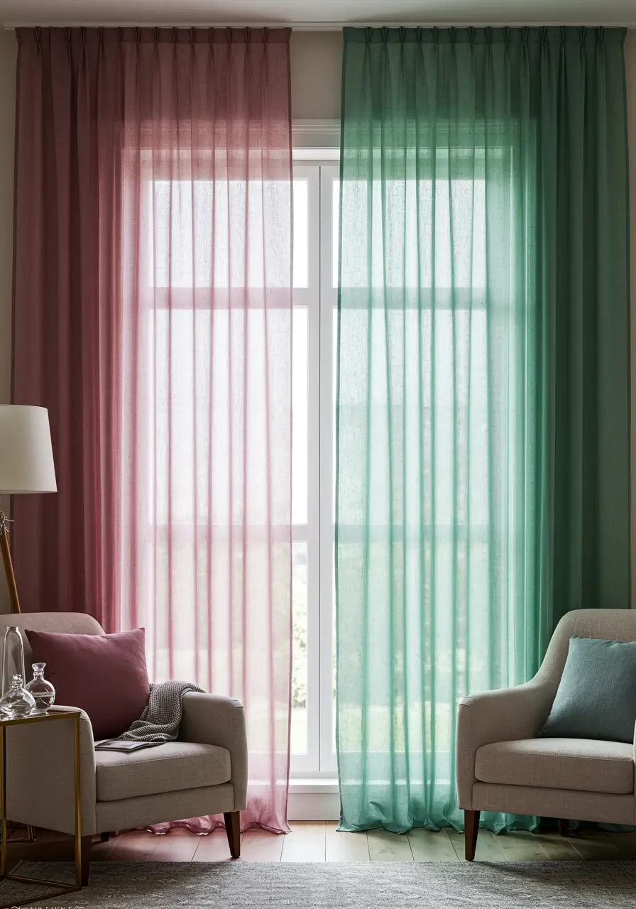
The specific way a fabric interacts with both natural sunlight and artificial evening light can dramatically alter exactly how a room feels to its occupants. Lighter colors naturally tend to reflect available light, making a cramped space feel significantly brighter and potentially much larger. Darker colors aggressively absorb light. This absorption can make a massive room feel much cozier or more enclosed, which is sometimes a highly desired effect depending on the room’s square footage and natural light levels. Sheer fabrics, completely regardless of their exact color, gently allow diffused light to enter the room. This creates a soft, ethereal glow throughout the day. Conversely, opaque heavy drapes offer complete light blockage and a much more substantial, grounding visual presence.
Creating Cohesion with Your Decor
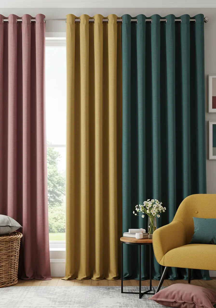
Window treatments are a genuinely fantastic, highly versatile tool for unifying a room’s scattered decor elements. Your chosen fabric can beautifully echo an accent shade pulled directly from a vintage rug, a large piece of modern artwork, or heavily textured throw pillows. This clever technique firmly ties these disparate elements together into a completely harmonious, intentionally designed whole. They can also successfully provide a sharp contrasting element that makes other muted colors in the room pop brilliantly. Alternatively, they can blend seamlessly with your wall paint for a highly subtle, sophisticated monochromatic effect. Your ultimate goal is to create a seamless visual conversation between your windows and the rest of your carefully chosen interior design.
Amazon US Verified
Peel and Stick Textured Linen Wallpaper
Removable neutral wall covering providing architectural warmth and tactile depth.
A Quick Guide to Color Harmony for Curtains
A little basic understanding of color relationships can truly go a long way in ensuring your choices are exceptionally chic and never chaotic. The traditional color wheel is absolutely your best friend when undertaking this design project.
Monochromatic Magic
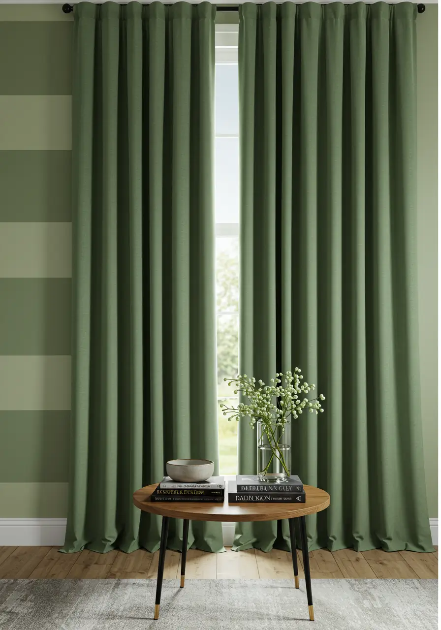
This highly popular approach involves utilizing various tones, shades, and delicate tints of one single color family. For a great example, if your walls are painted a pale sage green, you might deliberately choose fabric in a slightly deeper and richer sage. This creates a highly sophisticated, beautifully layered look that feels incredibly calming and cohesive. It is an absolute easy win for achieving an elegant, high end scheme in any room of your house.
Analogous Allure
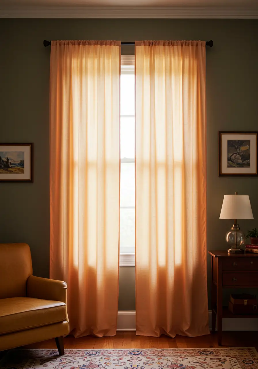
Analogous colors sit directly side by side on the traditional color wheel. Think of beautiful pairings like deep blue and rich teal, or sunny yellow and warm orange. Using these specific neighbor combinations for your walls and window treatments creates a deeply rich, highly blended effect that feels naturally harmonious. You often find these specific pairings thriving in nature. Think about soft buttery yellow walls paired gracefully with peachy orange fabric to create a space that feels incredibly warm and inviting.
Complementary Confidence
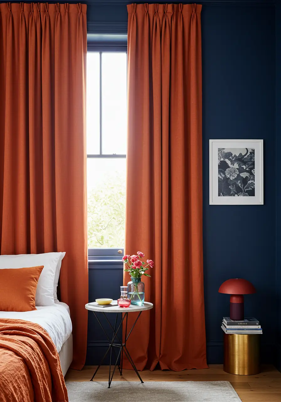
Complementary colors sit as complete opposites on the color wheel. Classic examples include bold blue and fiery orange, or regal purple and bright yellow. This daring pairing intentionally creates incredibly high contrast and makes both individual colors appear significantly more vibrant to the human eye. A dark navy blue accent wall paired directly with heavy fabric in a burnt orange or deep coral makes a very bold, highly confident design statement. You must use this aggressive approach thoughtfully to avoid visually overwhelming a small space.
The Power of Neutrals
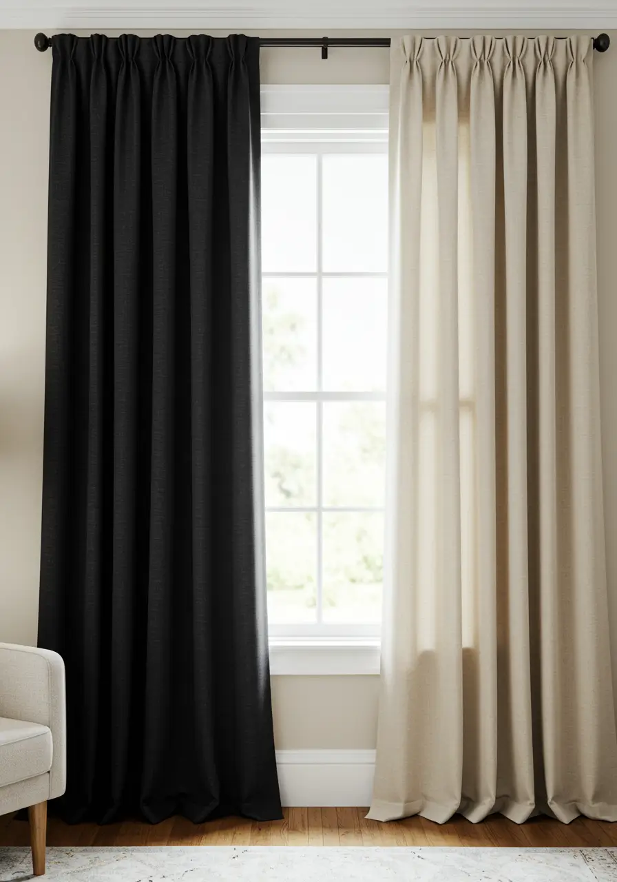
Neutrals like crisp white, warm cream, sandy beige, versatile grey, stark black, and rich tan are the ultimate chameleons of the interior decor world. They can easily provide a deeply calming background canvas, generously allowing your other colorful elements to brilliantly shine. Alternatively, they can be heavily layered together for a highly sophisticated, deeply textured aesthetic. Neutral fabrics are incredibly versatile and reliably work with almost any paint color or decor style you can imagine. This enduring flexibility makes them a perennially chic, entirely foolproof choice for anyone nervous about committing to bright colors.
Our Chic Curtain Color Ideas List
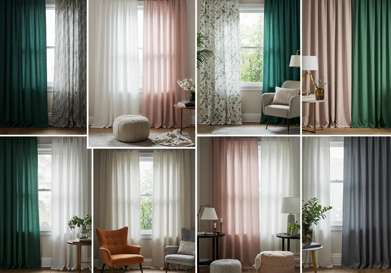
Let us explore some truly stunning, highly sophisticated combinations that are guaranteed to elevate your home decor to the next level. This curated list offers a wide range of beautiful options. It covers everything from quiet, subtle elegance to incredibly bold architectural statements, gently helping you find the absolute perfect pairings for your unique home.
1. White Curtains with Soft Grey Walls
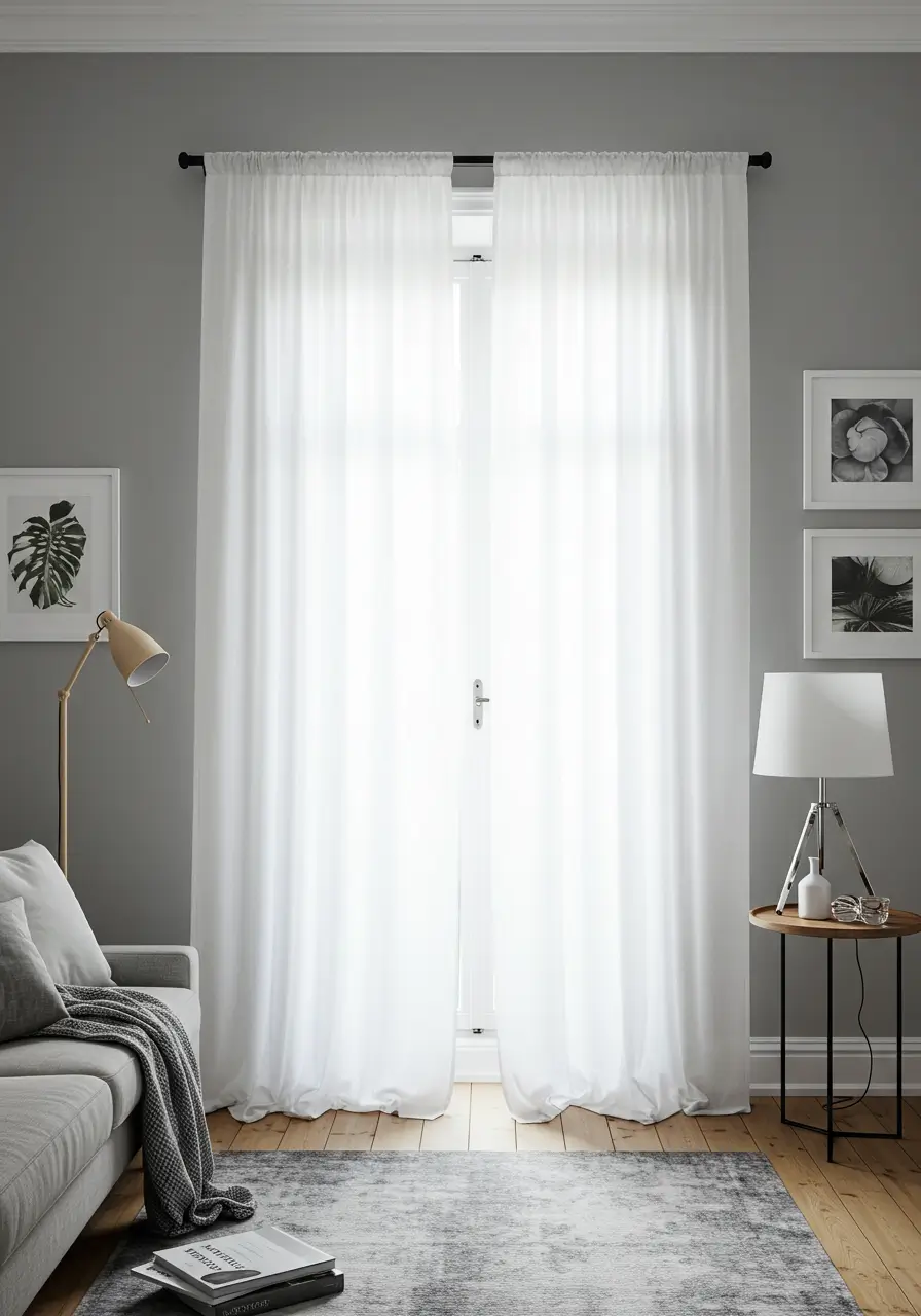
The Vibe: Airy, minimalist, profoundly sophisticated, and meticulously clean. This specific combination is a beloved modern classic that flawlessly maximizes natural light and actively creates a serene, completely uncluttered emotional feel.
Why it is Chic: Crisp, bright white fabric set directly against soft grey walls provides a very gentle, subtle contrast that feels highly elegant and refined. The grey paint offers a welcoming touch of either warmth or coolness entirely depending on its specific undertones, while the bright white keeps the entire space feeling illuminated. It serves as an absolutely perfect backdrop for Scandinavian, minimalist, or sleek contemporary decor styles. Flowing sheer white fabrics are particularly effective in this specific pairing, offering a delicate, light as air look that breathes life into the room.

Amazon US Verified
Ceramic Fluted Decorative Vase Set
Modern minimalist ceramic vases perfect for shelves, consoles, and dried florals.
Best Rooms: Living rooms, primary bedrooms, and focused home offices.
2. Navy Blue Curtains with Cream or Off-White Walls
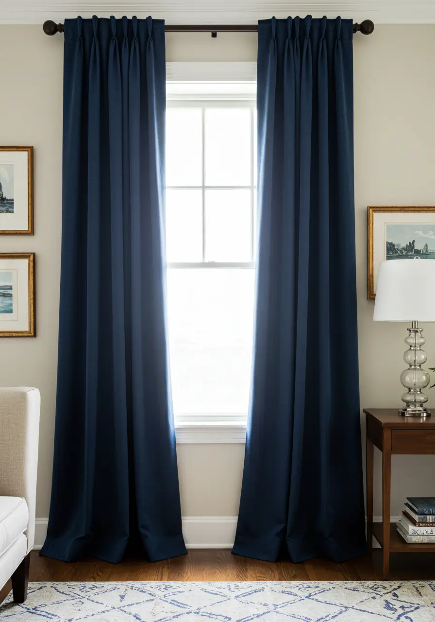
The Vibe: Timeless, subtly nautical, deeply sophisticated, and incredibly grounding. This classic pairing proudly offers a strong yet historically comforting visual contrast.
Why it is Chic: Deep, moody navy blue fabric acts as a highly rich, dramatic visual anchor against the inviting warmth of cream or off white walls. The resulting contrast is visually striking and powerful but never visually jarring or overwhelming. This specific combination lends itself exceptionally well to traditional, transitional, and breezy coastal interior design styles. You should highly consider utilizing heavy velvet or slub linen for the navy panels to massively enhance the tactile texture. This is a genuinely powerful design statement that never goes out of style.
Best Rooms: Primary bedrooms, formal entertaining living rooms, elegant dining rooms, and quiet home studies.
3. Emerald Green Curtains with White Walls and Gold Accents
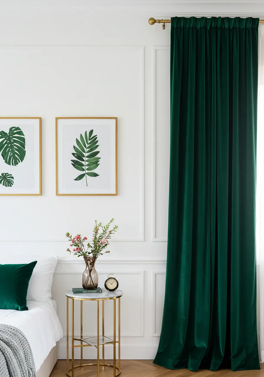
The Vibe: Unapologetically luxurious, highly glamorous, deeply opulent, and beautifully nature inspired.
Why it is Chic: Rich, highly saturated emerald green fabric makes an incredibly bold and luxurious statement against crisp, stark white walls. This is especially true when utilizing a heavy, light catching fabric like crushed velvet. The bright white paint keeps the overall look feeling fresh and actively prevents the deep jewel toned green from swallowing the space entirely. Adding polished gold or antique brass hardware like sturdy rods and decorative tie backs instantly enhances the opulent, high end hotel feel.
Best Rooms: Entertaining living rooms, formal dining rooms, and luxurious primary bedrooms where a distinct touch of dramatic Art Deco or Hollywood Regency glamour is highly desired.
4. Charcoal Grey Curtains with Blush Pink Walls
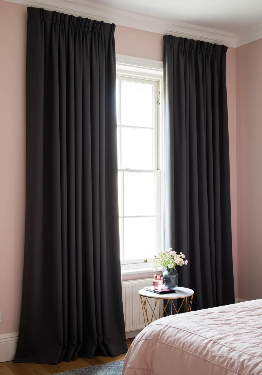
The Vibe: Distinctly modern, subtly romantic, highly sophisticated, and uniquely balanced with a soft industrial edge.
Why it is Chic: The incredibly deep, moody tone of heavy charcoal grey fabric provides a truly stunning, unexpected contrast to the soft, highly delicate hue of blush pink walls. This brilliant pairing expertly balances masculine and feminine design energies beautifully. It effortlessly creates a space that feels highly contemporary yet deeply inviting and safe. It is an unexpected, highly creative choice that demonstrates massive design confidence.
Best Rooms: Peaceful bedrooms, calming nurseries, modern living rooms, or even a highly chic home office space. It works flawlessly with modern, eclectic, or Parisian inspired styles.
5. Beige or Linen Curtains with Olive Green Walls
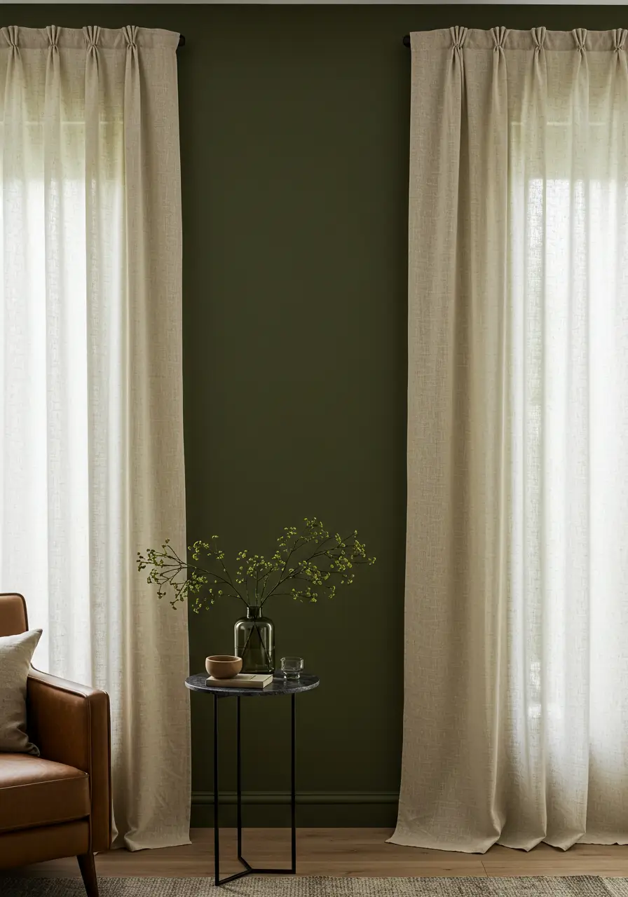
The Vibe: Deeply earthy, incredibly calming, highly natural, and beautifully warm.
Why it is Chic: Saturated olive green walls instantly create a profound sense of architectural depth and a direct visual connection to the natural world outside. Pairing these bold walls with neutral beige or completely natural, unbleached linen fabric keeps the main focus on the rich paint color while simultaneously adding essential softness and raw texture. This specific combination feels incredibly grounded, highly organic, and effortlessly stylish without trying too hard.
Best Rooms: Cozy living rooms, reading studies, guest bedrooms, or absolutely any space actively aiming for a calming biophilic design or a relaxed modern farmhouse aesthetic.
6. Mustard Yellow Curtains with Teal or Deep Blue Walls
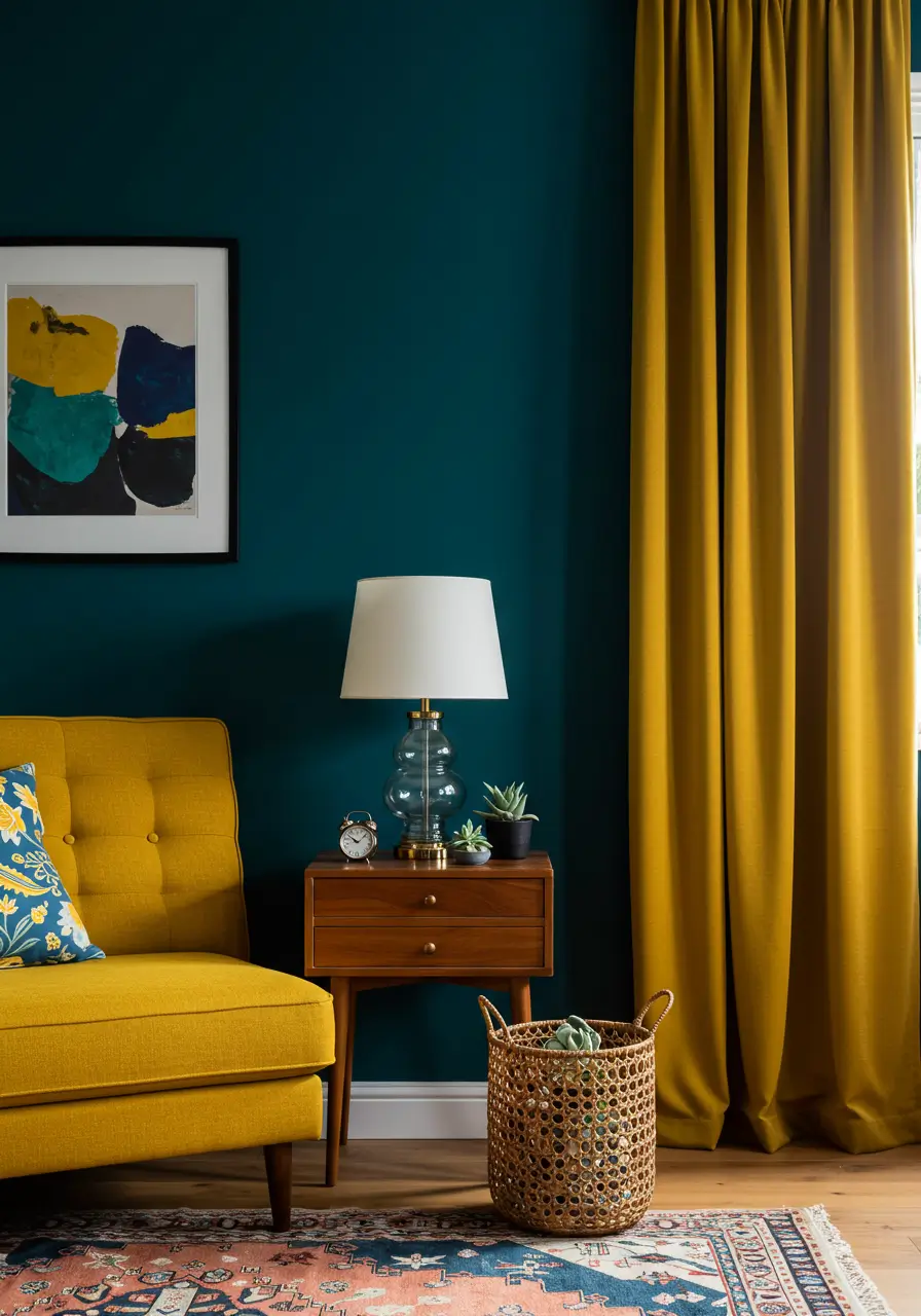
The Vibe: Unapologetically bold, wonderfully retro, highly artistic, and buzzing with positive energy. This is a textbook complementary color scheme that truly pops and demands attention.
Why it is Chic: The intense warmth and vibrant energy of mustard yellow fabric creates a highly striking, beautiful contrast against the cool, oceanic depth of teal or dark navy blue walls. This brave combination is absolutely perfect for those who genuinely love saturated color and desperately want to make a massive, unforgettable design statement. It very often successfully evokes a highly curated mid century modern or eclectic bohemian feel. Choosing this route shows immense design confidence and a fun personality.
Best Rooms: High energy living rooms, lively dining rooms, creative art studios, or absolutely any space that can confidently handle a massive, joyful injection of color.
You may also enjoy reading: Circular Booth Seating: 10 Chic Ideas for Modern Dining Rooms.
7. Cream or Ivory Curtains with Warm Terracotta Walls
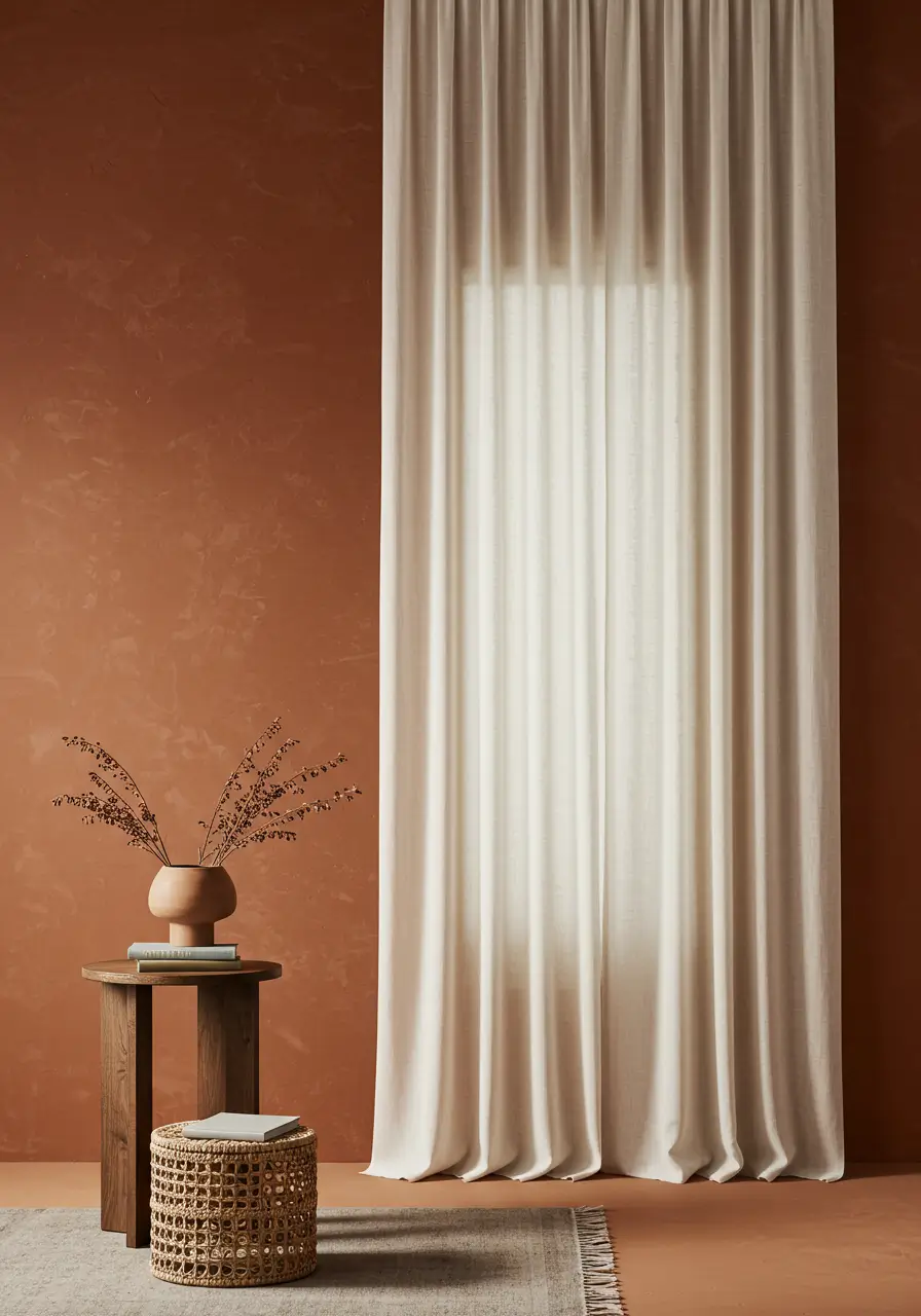
The Vibe: Grounded, incredibly cozy, beautifully Southwestern inspired, and highly inviting.
Why it is Chic: Baked terracotta walls bring a deeply rich, earthy warmth to absolutely any space they touch. Hanging crisp cream or soft ivory fabric provides a highly necessary, light visual contrast. This critical balance permanently prevents the heavy terracotta from feeling too visually oppressive or cavernous, while still perfectly maintaining the overall warm, sun baked atmosphere. This gorgeous pairing is absolutely perfect for creating a rustic yet highly refined and sophisticated look.
Best Rooms: Relaxed living rooms, bustling kitchens, casual dining areas, or bright sunrooms. This is especially true for spaces featuring natural raw wood architectural elements or heavy Mediterranean influences.
8. Layered Sheer White Curtains with Heavier Natural Linen Drapes
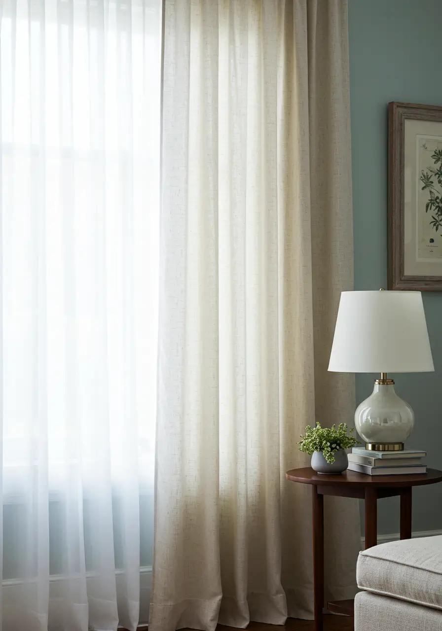
The Vibe: Incredibly soft, beautifully ethereal, highly textured, and effortlessly elegant. This option offers truly unmatched, superior light control.
Why it is Chic: Strategic layering provides both ultimate daily functionality and breathtaking beauty. The sheer white base layer diffuses harsh daylight beautifully and offers essential daytime privacy without sacrificing illumination. The heavier linen drapes add massive visual texture, incredible warmth, and can be drawn tightly for complete light blockage or winter insulation. This highly professional approach works flawlessly with almost any soft paint color, from pale dusty blues and sage greens to warm, earthy neutrals.
Best Rooms: Primary bedrooms and formal living rooms where highly flexible daily light control and a luxurious, five star hotel feel are strongly desired. This is a universally appealing, highly practical strategy.
9. Dove Grey Curtains with White Walls and Black Accents
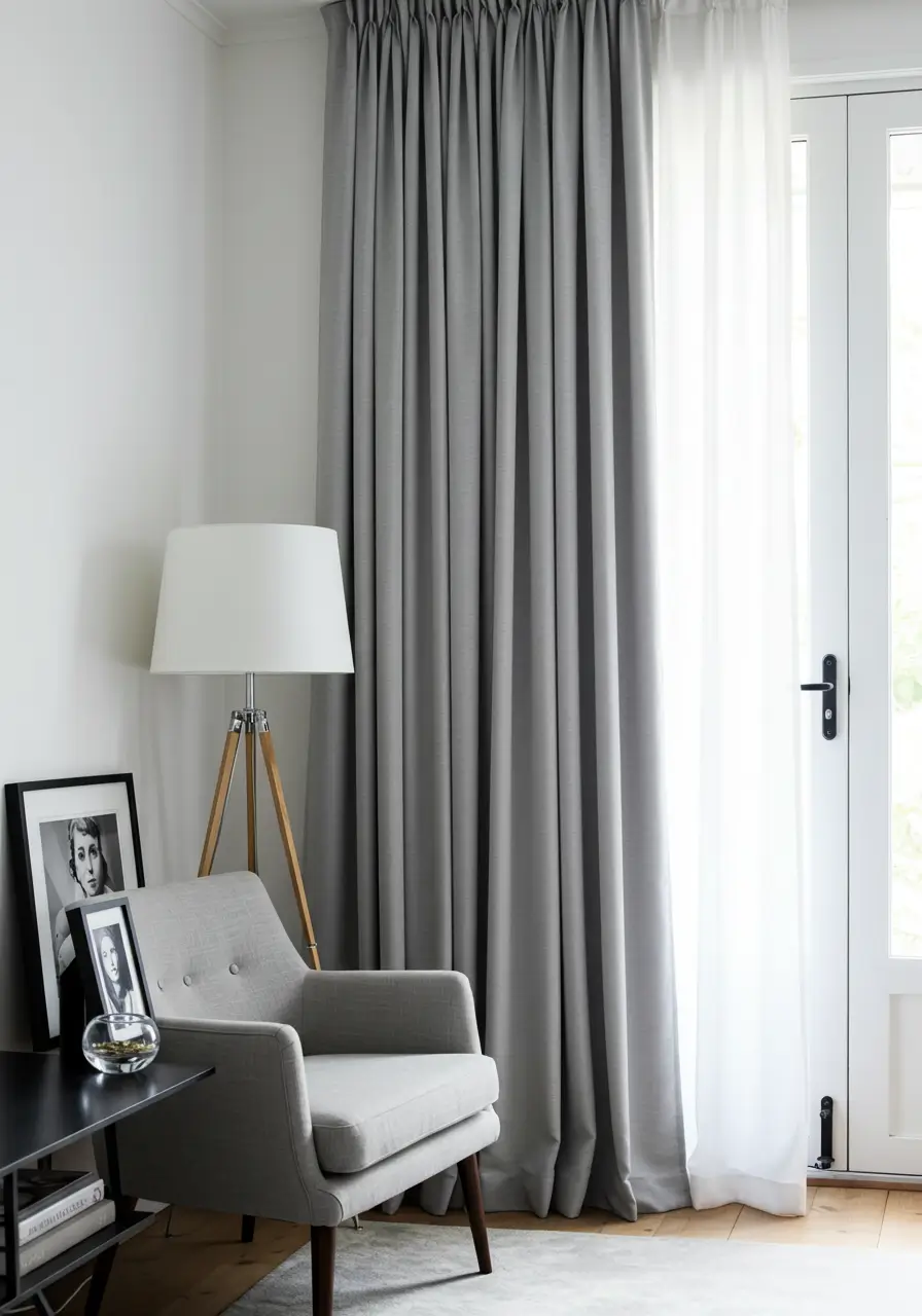
The Vibe: Strictly minimalist, highly contemporary, and sharply, undeniably sophisticated.
Why it is Chic: This specific combination effortlessly creates a meticulously clean, almost graphic architectural look. Soft, powdery dove grey fabric provides a highly gentle, soothing contrast against crisp, gallery white walls. Introducing small, highly deliberate black accents elsewhere in the room ties the entire scheme together perfectly. Think about matte black picture frames, a sleek metal lamp base, or black iron curtain hardware. This results in a very polished, highly curated modern aesthetic.
Best Rooms: Sleek modern living rooms, focused executive home offices, and stark contemporary bedrooms.
10. Patterned Curtains with a Solid Wall Color Picked From the Pattern
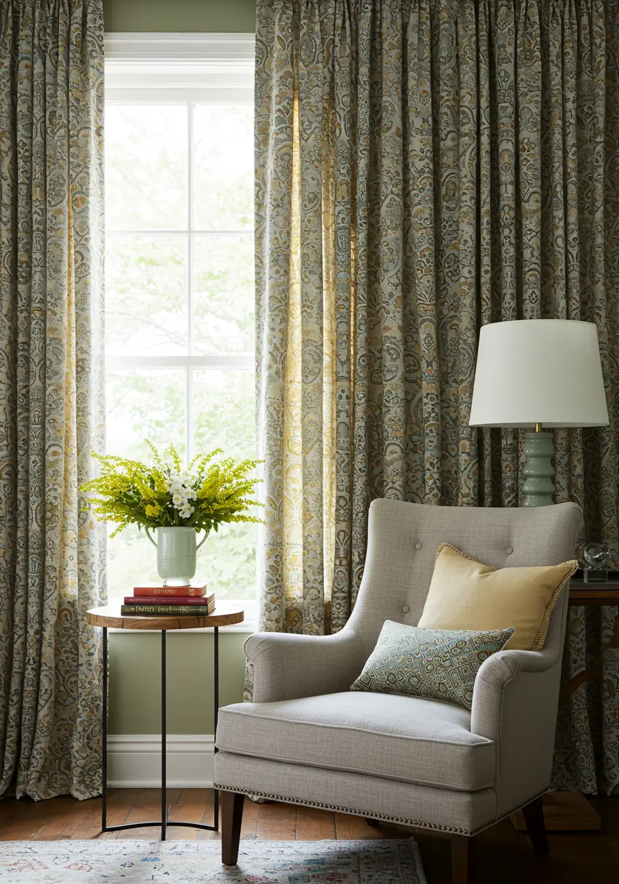
The Vibe: Highly personalized, beautifully cohesive, and incredibly visually interesting.
Why it is Chic: Confidently choosing patterned fabric instantly adds massive visual depth and incredible personality to a boring room. To expertly ensure a harmonious look that does not give you a headache, select a pattern that is not too visually overwhelming for the specific room size. Then, the secret designer trick is to pick one of the less dominant, quieter colors from the fabric pattern to use as your solid wall paint. This creates a highly intentional, meticulously coordinated design that looks wildly expensive and custom tailored.
Best Rooms: Family living rooms, cozy guest bedrooms, and vibrant dining rooms. You must ensure the physical scale of the pattern is highly appropriate for the total square footage of the room.
11. Warm Greige Curtains with Soft White Walls
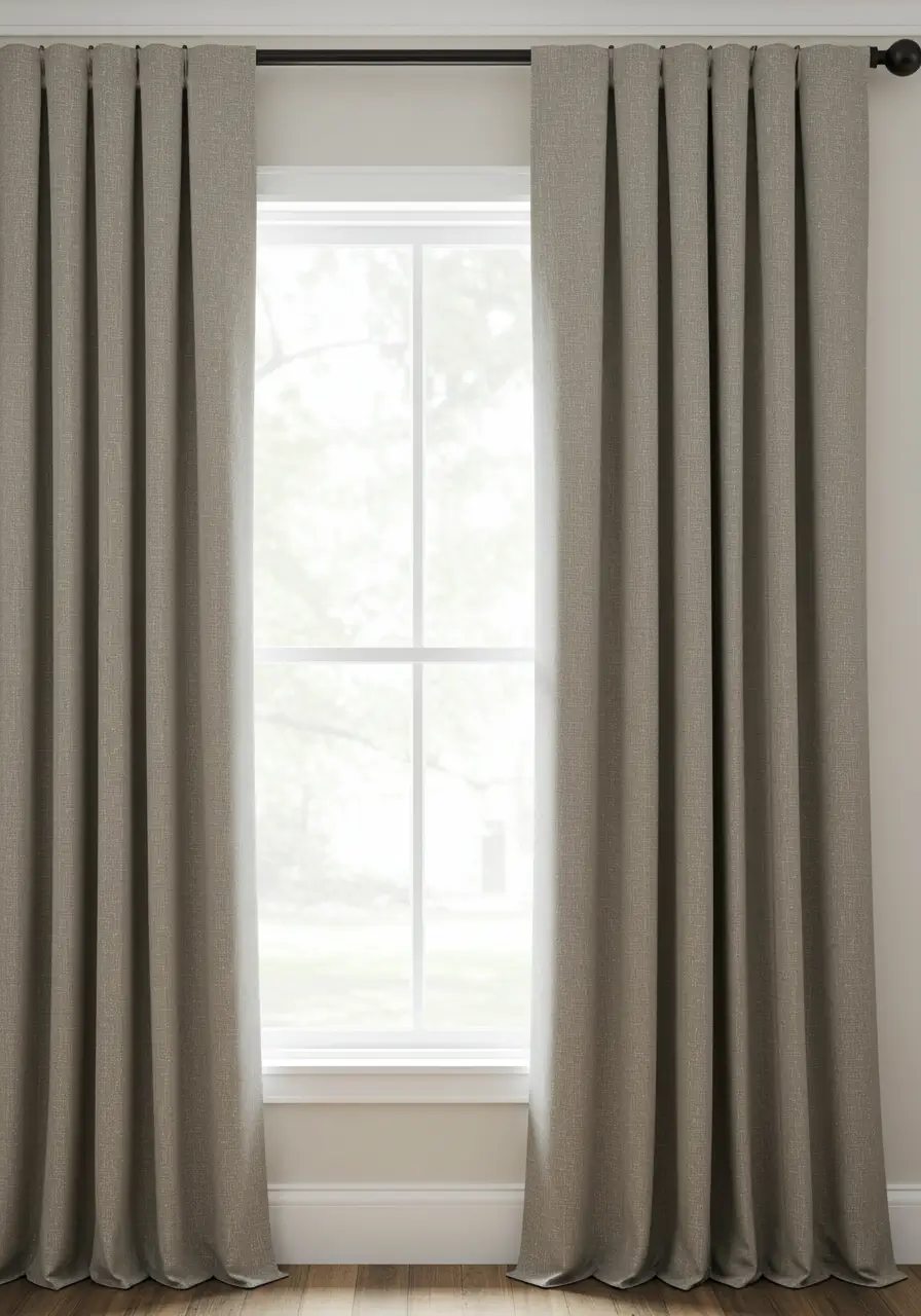
The Vibe: Supremely cozy, highly modern neutral, deeply sophisticated, and endlessly versatile.
Why it is Chic: Greige is a brilliant, highly popular neutral that offers significantly more inviting warmth than stark plain grey, but it remains incredibly sophisticated and modern. Pairing greige fabric with soft, creamy white walls creates a highly subtle, deeply inviting, and incredibly current look. It serves as an absolutely perfect, quiet backdrop for various evolving decor styles and allows for the incredibly easy introduction of brightly colored seasonal throw pillows or bold art. This is a heavily relied upon, go to modern choice for professional designers.
Best Rooms: Virtually any room in your entire home. It works beautifully in main living rooms, peaceful bedrooms, active family rooms, and clean home offices.
12. Rich Burgundy or Plum Curtains with Creamy Beige or Warm Grey Walls
The Vibe: Deeply luxurious, highly traditional, wonderfully cozy, and unapologetically dramatic.
Why it is Chic: Deep, saturated burgundy or rich plum fabric brings an immediate sense of grand opulence and enveloping warmth to a space. This is especially true when you choose heavy, tactile fabrics like lush velvet or thick, lined linen. Pairing these heavy, dramatic fabrics with creamy beige or a very warm toned grey paint permanently prevents the room from feeling too dark or gothic. This allows the rich fabric to truly be the star of the show. This combination is absolutely perfect for creating a cozy, highly inviting winter retreat.
Best Rooms: Formal evening dining rooms, grand primary bedrooms, traditional formal living rooms, or moody home libraries.
Factors to Consider When Choosing Your Curtain Color Combinations
While our chic list offers incredible foundational inspiration, selecting the absolute perfect pairing for your unique home involves significantly more than just picking two random colors you happen to like. Several highly practical and aesthetic factors should strictly guide your final decision. This ensures your chosen treatments not only look stunningly beautiful but also function perfectly within your specific architectural space.
Room Size and Natural Light Levels
This is undeniably a crucial, make or break consideration. Color can dramatically, physically affect the human perception of square footage.
Small or Dark Rooms: If your specific room is physically small or unfortunately does not receive a lot of natural sunlight, opting for significantly lighter combinations is generally highly advisable. Light, airy colors like stark white, soft cream, pale dove grey, delicate pastels, or even light toned sheers can drastically help make the space feel much more open, breezy, and significantly brighter by actively reflecting available light around the room. You must actively avoid very dark or heavily lined fabrics in small spaces, as they aggressively absorb light and make the room feel much more enclosed and tiny than it actually is in reality. A highly monochromatic scheme with fabric just a few shades lighter than the walls can also massively enhance the optical sense of space.
Large or Bright Rooms: In much larger rooms blessed with ample, flooding natural light, you have significantly more design flexibility with your choices. You can confidently, boldly embrace much darker shades, wildly bolder patterns, or rich, saturated jewel tones without ever worrying about them visually swallowing the space. In fact, deeper, richer colors can effectively add a highly necessary sense of coziness and intimate scale to a very large, echoing room. If intense, blinding afternoon sunlight is a daily issue, strongly consider fabrics with excellent light blocking properties. Layering sheer panels with heavier, blackout lined drapes offers incredibly versatile, daily light management.
Existing Furniture and Overall Decor Style
Your window treatments absolutely must feel like a highly integral, planned part of your room’s existing design story, not a frantic afterthought you purchased at the last minute.
Harmonizing with Furniture: Look very closely at the truly dominant colors and prominent patterns heavily featured in your existing furniture. Pay special attention to massive, visually heavy pieces like your main sofa, large armchairs, or a dominant bedspread. Your chosen fabric should logically do one of three things. It could easily pick up a secondary or minor accent color directly from a patterned area rug, a floral sofa, or a piece of large artwork. It could beautifully complement the main, solid color of your largest furniture pieces. Or, it could successfully provide a quiet, neutral backdrop if other massive elements in the room are already very bold and highly colorful.
Aligning with Decor Style: The specific color and the actual physical texture of the fabric must accurately reflect your room’s firmly established interior decor style. For a strict minimalist or airy Scandinavian look, stick to light, breezy neutrals and completely simple textures with clean lines. For a wild bohemian or collected eclectic vibe, embrace earthy grounding tones, rich jewel tones, and highly vibrant patterns like ikat or paisley. Traditional or highly formal rooms demand classic, historic colors like deep navy, rich burgundy, or forest green, very often utilizing heavier, luxurious fabrics like silk or heavy jacquard. Modern farmhouse spaces thrive on soft, warm neutrals and natural, unbleached linen fabrics.
Desired Mood and Atmosphere of the Room
Color significantly, undeniably influences the deep emotional feel of any space. You must ask yourself what specific atmosphere you are actively trying to create.
Calm and Relaxing Spaces: For bedrooms and spa like bathrooms, heavily opt for cool, receding colors like soft blues and gentle greens, powdery greys, muted pastels, or highly serene neutrals. These specific hues are scientifically known for their deeply soothing, stress reducing properties.
Warm and Inviting Spaces: For highly social areas like living rooms and dining rooms, strongly consider warm, welcoming neutrals like rich cream, sandy beige, or warm greige. Welcoming, energetic colors like soft buttery yellows, baked terracotta, or muted peaches actively create a highly cozy and incredibly sociable ambiance for entertaining guests.
Sophisticated and Dramatic Spaces: For formal dining rooms, grand primary bedrooms, or cozy home libraries, embrace deep, moody jewel tones. Think about rich emerald, deep sapphire, dramatic ruby, or dark amethyst. Charcoal grey, dark navy blue, or rich chocolate browns effectively create an undeniable sense of high end luxury, moody drama, and quiet intimacy.
Curtain Fabric, Texture, and Pattern Scale
The actual physical material and tactile finish of the fabric itself heavily influence exactly how the color is perceived by the human eye and how it ultimately contributes to the room’s overarching style.
Fabric’s Influence on Color: Matte fabrics like raw linen and basic cotton will generally make colors appear significantly softer, much more natural, and slightly muted. Lustrous, shiny fabrics like crushed velvet, pure silk, or smooth sateen can make those exact same colors appear infinitely richer, much deeper, and significantly more luxurious entirely due to the fabric’s natural sheen catching the light. Sheer, gauzy fabrics like voile or organza will naturally be highly translucent, beautifully allowing sunlight to filter directly through and creating a very light, highly airy effect that softens the entire room.
Texture’s Role: Highly textured weaves like slub linen, soft chenille, or heavy corduroy instantly add massive visual depth and highly tactile interest to solid color choices. This crucial texture permanently prevents solid colors from looking flat, boring, or cheap.
Pattern Scale: If you are bravely choosing patterned fabrics, you must ensure the physical scale of the repeating pattern is highly appropriate for both the room size and the window size. Massive, oversized bold patterns can easily swallow and overwhelm small rooms. Conversely, very tiny, delicate patterns might get completely lost and look like a blurry mistake in massive, echoing spaces. Always carefully consider exactly how the pattern repeats and how it will visually look when the panels are pulled completely open versus when they are drawn tightly closed.
Tips for Implementing Your Curtain Color Choices Successfully
You have carefully reviewed our chic ideas list and deeply considered the crucial architectural factors of your home. Now, a few final, highly practical implementation tips will actively help you bring your chosen combinations to life seamlessly. This ensures they look absolutely stunning, professional, and custom tailored in your specific space.
Always, Always Get Fabric Swatches
The Golden Rule of Curtain Selection: This simply cannot be emphasized enough by professional designers. You must never, under any circumstances, make a final, expensive fabric decision based solely on exactly how it looks on a glowing computer screen, printed in a catalog, or hanging under the harsh, artificial fluorescent lights of a retail store. Colors can and absolutely will vary dramatically depending on your specific home lighting and the surrounding hues in your room.
Testing in Your Own Environment: You must obtain physical fabric swatches of your absolute top choices. Bring them into your home and physically view them in the actual, specific room where they will eventually hang. You need to observe them carefully at different times of the day. Look at them in bright, harsh morning light, softer fading afternoon light, and directly under your warm artificial evening lamps. Hold the swatches directly against your freshly painted walls, lay them next to your sofa upholstery, and place them near other significant decor elements. This is the absolute only foolproof way to truly see exactly how the color interacts with your specific space.
Consider Curtain Length and Fullness for Impact
The specific way the fabric physically hangs from the rod significantly, undeniably impacts their overall chicness and perceived expense.
Choosing the Right Length: Floor length panels that either lightly graze or barely kiss the floor are generally the absolute most elegant, highly popular, and foolproof choice for living rooms and bedrooms. The fabric should just barely touch the floor or hover exactly half an inch above it for a highly tailored, custom professional look. Allowing extra fabric to pool or puddle on the floor creates a very luxurious, highly formal, or deeply romantic effect. However, puddling works best exclusively with heavier, luxurious fabrics and can quickly collect massive amounts of pet hair and dust, making it highly impractical in busy high traffic areas.
Achieving Proper Fullness: For a truly rich, highly luxurious, and expensive appearance, your panels should generally have a combined physical width that is at least two to two and a half times the actual width of your window. Skimpy, flat panels that just barely cover the glass when pulled closed will always look incredibly cheap and completely unfinished. This lack of fullness will instantly detract from even the most beautiful, expensive color choice.
Don’t Overlook Curtain Hardware
The supporting hardware elements are a massive, highly visible part of the overall design scheme and should never be an afterthought.
Rods, Rings, Finials, and Tie-Backs: The actual rod itself, along with any attached rings, decorative finials, and heavy tie backs, absolutely must complement both your chosen fabric color and the overall architectural style of your room. Specific finishes like modern matte black, sleek brushed nickel, warm antique brass, or various rich wood tones can effectively add a highly subtle or massively significant design detail to the window.
Strategic Rod Placement: To successfully make your windows appear significantly taller and much grander, you must mount the rod several inches above the actual window frame. Mount it as close to the ceiling line or crown molding as physically possible. Furthermore, extending the rod three to six inches wider than the window frame on each side beautifully allows the fabric panels to be drawn fully clear of the glass when open. This crucial designer trick maximizes your natural light and beautifully frames your outdoor view.

Amazon US Verified
Hang-O-Matic All-in-One Picture Hanging Tool
Tape measure, sliding level, and markers in one tool for flawless gallery walls.
Layering for Depth and Versatility
Sheers with Opaque Drapes: As highlighted heavily in our ideas list, intentionally layering a lightweight, airy sheer panel underneath heavier, opaque outer drapes offers absolute maximum flexibility. It provides daytime privacy and beautifully diffused light, while allowing you to block out the world completely at night. This also allows for incredibly interesting, highly custom combinations of contrasting colors and varying textures.
Curtains Over Blinds or Shades: You can also brilliantly add decorative, stationary side panels directly over existing, highly functional window treatments like woven Roman shades, cellular shades, or simple roller blinds. This instantly softens the harsh architectural look of the blinds, adds highly necessary color and pattern, and can massively improve your winter insulation or total light blockage.
Frequently Asked Questions
Should curtains be lighter or darker than the surrounding walls?
There is absolutely no hard and fast, unbreakable rule here, as it depends entirely on the specific emotional effect you want to successfully achieve. Fabric that is just a few delicate shades lighter or slightly darker than the walls effortlessly creates a highly subtle, beautifully cohesive monochromatic look. Significantly lighter fabric can successfully make a cramped room feel much airier and open, while much darker fabric can instantly add moody drama or enveloping coziness. For a much bolder, confident statement, a highly contrasting color can be effectively used to draw the eye directly to the window.
What specific curtain colors make a small room look bigger?
Light, cool, and highly neutral choices consistently tend to make a small, cramped room feel significantly more spacious, breezy, and open. Think about crisp whites, warm creams, pale dove greys, soft powdery blues, or very light, airy pastels. Strategically keeping the fabric color very similar to the actual wall paint color also massively helps create an entirely uninterrupted visual flow around the room. This lack of visual interruption heavily enhances the optical sense of space. Very sheer, gauzy fabrics that allow ample sunlight to pass through contribute massively to this expanding effect as well.
How do I choose curtain colors if I have heavily patterned wallpaper?
If your room features wallpaper with a very prominent, busy, or large scale pattern, it is almost always best to choose solid colored window treatments. This actively avoids a visually overwhelming, chaotic, or heavily clashing look that will give you a headache. Select a solid color that perfectly picks up one of the quieter, less dominant accent colors directly from your wallpaper pattern for a highly coordinated, custom feel. Alternatively, a deeply calming neutral color like cream, warm beige, or a soft grey that perfectly complements the wallpaper’s background hue can successfully provide a highly necessary, calming visual balance to the busy room.
Are patterned curtains still considered in style for modern homes?
Yes, patterned fabrics absolutely remain a highly stylish, deeply popular option for modern interior design. However, the current major trend leans heavily towards much more sophisticated, highly nature inspired, or very subtly geometric patterns. The industry is moving completely away from overly fussy, outdated, or heavy chintz florals. Think about elegant organic botanicals, flowing abstract designs, timeless classic stripes, or highly refined, small scale geometric prints. The absolute key to success is firmly ensuring the pattern’s physical scale and specific colorway perfectly complement the room’s overall decor and do not aggressively compete with other strong patterns in the space.
What curtain color is absolutely best for a primary bedroom to actively promote better sleep?
For a primary bedroom, cool, receding, and highly calming choices are generally considered the absolute best for actively promoting a deeply restful atmosphere that is conducive to quality sleep. Various shades of blue, especially highly muted or dusty blues like deep navy or soft sky blue, are scientifically proven to lower heart rates. Soft greens like earthy sage or pale mint, and highly soft greys or gentle lavenders are also excellent, soothing options. Darker, heavily saturated versions of these specific colors can also be incredibly effective. This is particularly true if they are specifically made from heavy, light blocking fabrics to completely ensure a pitch black, cave like sleeping environment.
This Post Contains Affiliate Links
Transform Your Home With the Perfect Curtains
The journey to perfectly dressed windows is an incredibly rewarding one. Choosing the absolute right combinations does so much more than just cover a bare window. It completely infuses your living space with your unique personality, actively sets your desired emotional mood, and beautifully harmonizes all the disparate elements of your interior decor. Testing physical fabric swatches in your own home is an absolutely indispensable step, completely ensuring the colors translate beautifully from a glossy inspiration board to your everyday reality.
Ultimately, the perfect pairings are the ones that successfully make your house feel much more like a thoughtfully, lovingly curated home. It should be a space that is not only visually stunning to guests, but also deeply, profoundly comfortable and a true, authentic reflection of exactly who you are.
Are you ready to completely elevate your space and turn your bare windows into captivating, chic focal points?
Click to Read the Full Guide and be sure to pin this comprehensive list to your favorite Pinterest home decor board so you always have this expert inspiration right at your fingertips when you are ready to redecorate!
>
As an Amazon Associate, azuloz.com earns from qualifying purchases.