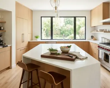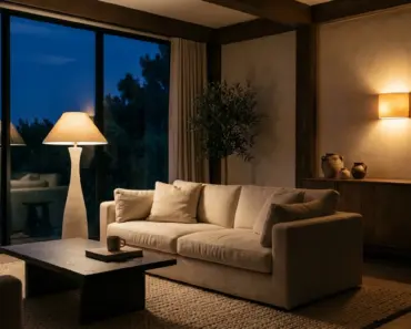

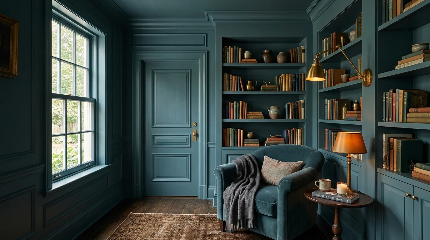
You stand in the local hardware store or design boutique, completely enchanted by a two-inch paint swatch. Under the store’s bright showroom lighting, the color looks like the quintessential serene, warm alabaster white—crisp, luminous, with just a hint of earthy oatmeal warmth. You purchase four expensive gallons of premium interior paint, hire professional painters, and eagerly await the transformation of your living room.
The painters finish. You step across the threshold to inspect the finished walls, and your jaw drops in horror. The serene warm alabaster is gone. In its place is a cold, sickly, greenish-gray haze that makes your living room look like a dim hospital ward. In the corners, the paint looks muddy and shadowy; near the window, it glares with a harsh, chalky fluorescence. You check the paint can label, convinced the mixer made a catastrophic tinting error.
The paint formula was mixed with computerized perfection. What failed was your understanding of two fundamental physical laws of optics and human visual perception: Light Reflectance Value (LRV) and optical metamerism. Paint does not possess an inherent, fixed color; paint is merely a pigmented chemical filter that reflects whatever spectral wavelengths happen to hit it. Understanding how your room’s cardinal orientation and lighting Kelvin curves manipulate color is the secret to achieving flawless architectural finishes every single time.
The Physics of Light Reflectance Value (LRV): The Universal Scale
On the back of every professional paint swatch from Benjamin Moore, Sherwin-Williams, or Farrow & Ball is a small number labeled LRV. Most homeowners ignore it, assuming it is an internal manufacturing barcode. In reality, it is the single most important number in interior design.
Light Reflectance Value (LRV) is a standardized photometric scale running from 0 to 100 that measures the precise percentage of visual light a paint surface reflects back into a room:
- LRV 0: Absolute black (absorbs 100% of light energy, reflecting nothing).
- LRV 100: Theoretical pure white (reflects 100% of light energy, absorbing nothing).
- Pitch Black Paints (e.g., Tricorn Black): LRV 2 to 4.
- Medium Muted Neutrals (e.g., Greiges, Warm Taupes): LRV 45 to 58.
- Off-Whites and Creams: LRV 68 to 82.
- Pure Architectural Whites (e.g., Chantilly Lace): LRV 88 to 92.
The cardinal error of amateur interior decorating is using a low-LRV paint in a room that lacks strong natural daylight. If a room has small windows, heavy exterior tree canopy, or faces an interior courtyard, the ambient light level is naturally low. If you paint that room with a popular “greige” possessing an LRV of 52, the walls will absorb nearly half the available light. The paint will literally drink the room’s daylight, collapsing the space into a gloomy, cave-like gloom.
“Paint does not create light; it can only reflect the light that already exists. A paint color with an LRV below 65 in a low-light room will always turn muddy and somber.”
The Optical Phenomenon of Metamerism: Why Colors Morph
Have you ever bought two black socks in a department store, only to step into morning sunlight and realize one is navy blue and the other is dark brown? That is optical metamerism—the physical phenomenon where two color samples appear to match under one light source, but appear completely different under another.
Paint pigments are complex mineral oxides (titanium dioxide, yellow iron oxide, lamp black, red oxide). Each pigment absorbs and reflects specific electromagnetic wavelengths along the 380 to 750 nanometer visual spectrum.
When you view a paint swatch inside a retail store, the store is illuminated by commercial fluorescent or 4000K cool-white LED tubes. These lamps emit high volumes of blue and yellow wavelengths. When you bring that same swatch into your home, your living room is illuminated by a mixture of outdoor daylight and 2700K warm incandescent lamps. Because the incoming spectral energy is fundamentally different, the reflected light shifts completely. The paint’s hidden undertones—greens, grays, violets, and pinks—are violently activated.
The Cardinal Orientation Compass: Kelvin Temperatures Across the Compass
Natural daylight is not uniform; its color temperature (measured in Kelvin) and spectral intensity vary drastically depending on the direction your room’s windows face:
1. North-Facing Rooms (The Cool Blue Shadow)
North-facing windows never receive direct sunlight. They receive exclusively diffuse skylight reflected off the upper atmosphere. This light is cool, crisp, and heavily tinted with blue and cyan wavelengths (8,000K to 12,000K).
Cool light acts like an Instagram blue filter. If you paint a North-facing room with a cool gray or a sterile pure white, the blue light will exaggerate the cool undertones, making the room look icy, sterile, and dingy. To balance North-facing light, you must choose paints with warm, creamy yellow, peach, or pink undertones with an LRV between 68 and 74. The warm pigments neutralize the cool blue skylight, resulting in a balanced, luminous neutral.
2. South-Facing Rooms (The Golden Solar Blast)
South-facing rooms enjoy intense, warm direct sunlight throughout the entire day (3,000K to 4,500K). This golden light enhances warm colors and bathes everything in rich solar energy.
If you use an overly warm, yellow-based cream in a South-facing room, the golden sunlight will amplify the yellow pigments, turning your walls into glaring French mustard. In South-facing rooms, you have complete architectural freedom: you can choose cool-toned whites, soft greiges, or muted organic sage greens with an LRV of 55 to 65. The warm daylight will naturally soften the cool undertones into effortless perfection.
3. East-Facing Rooms (The Diurnal Shift)
East-facing rooms experience a dramatic split personality: blazing, warm golden light at sunrise that gradually transitions into cool, blue-shadowed light by early afternoon. Choose balanced, flexible neutrals that feature subtle green or stone undertones that adapt gracefully across the diurnal shift.
4. West-Facing Rooms (The Sunset Fire)
West-facing rooms start the day in cool, shadow-dappled gray, and end the afternoon with an intense, fiery orange-red solar glare. Beware of bright terracotta or warm yellow paints here, which can feel uncomfortably hot and oppressive during late afternoon dinner hours. Opt for cool, muted taupes and stone neutrals that absorb the afternoon heat gracefully.
📥 Free Download: Paint LRV & Metamerism Architectural Field Guide
Color physics: Light Reflectance Value calculations, optical metamerism under artificial LED lamps, cardinal orientation kelvin curves, and foam board testing.
The Master Color Testing Protocol: The 2×2 Foam Board Secret
Never, under any circumstances, paint sample swatches directly onto an existing colored wall! If you paint a square of fresh white paint onto a yellow or beige wall, your visual cortex immediately evaluates the new swatch against the old background color (the optical law of simultaneous contrast). The swatch will look falsely cool or dingy.
Follow the master architectural testing sequence:
- Purchase 24×24-Inch White Foam Core Boards: Buy two or three large poster-sized white foam boards from a craft store.
- Paint Two Generous Coats with a 2-Inch Border: Paint the sample color across the center of the board, but leave an unpainted 2-inch border of pure white around the entire perimeter. This pure white border visually isolates the sample pigment, allowing your brain to judge the true undertone without interference from the surrounding wall.
- Move the Board Across All Four Walls: Mount the board with painter’s tape on the North, South, East, and West walls.
- The 4-Times-of-Day Inspection: Inspect the board at 8:00 AM (morning light), 1:00 PM (midday sun), 5:30 PM (golden hour), and 9:00 PM (under your actual artificial evening lamps). If you love the color across all four time zones, you have found your winner.
Paint with the Mastery of an Architectural Colorist
Color is not a static coat of cosmetic makeup spread across drywall; it is a dynamic, living interaction between quantum chemistry, solar angles, and human perception. When you stop fighting the physics of light and start harmonizing your paint choices with LRV thresholds and cardinal orientations, the frustration of decorating evaporates.
You create a home where every wall breathes with spatial harmony—radiating with effortless warmth in winter shadows, glowing with serene elegance in summer daylight, and enveloping your family in a tailored sanctuary of timeless visual peace.