
Color Combinations for Clothes: Easy Outfit Formulas and 2026 Palettes
The easiest way to combine clothing colors is to choose one dominant shade, support it with a neutral or related color, and use a third color only as an accent. You do not need a perfectly matched wardrobe or strict rules. A clear relationship between the colors—tonal, analogous, complementary, or neutral-plus-accent—is usually enough to make an outfit feel intentional.
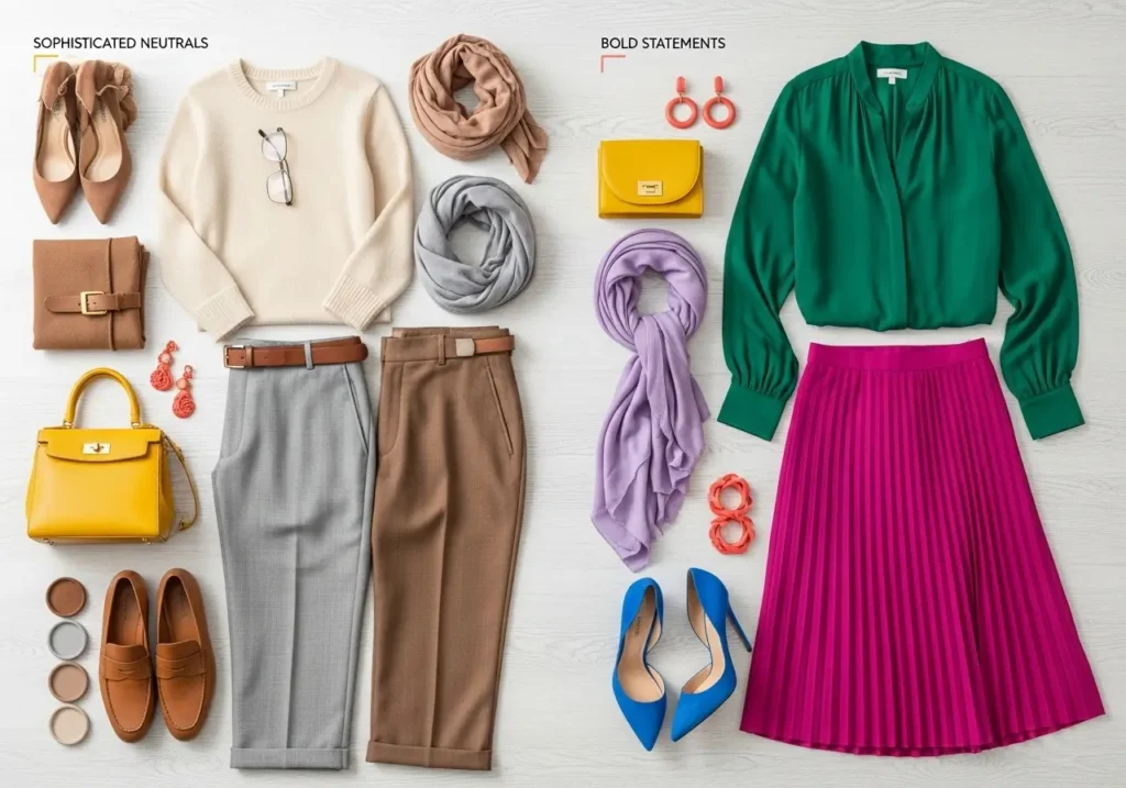
This guide shows you how to apply the color wheel, use practical outfit formulas, explore notable 2026 palettes, and coordinate bags and accessories without buying an entirely new wardrobe.
Four Reliable Ways to Combine Clothing Colors
Color theory is most useful when it simplifies a decision. Begin with these four relationships, then adjust the brightness, depth, and proportion until the outfit suits your style.
1. Monochromatic or Tonal
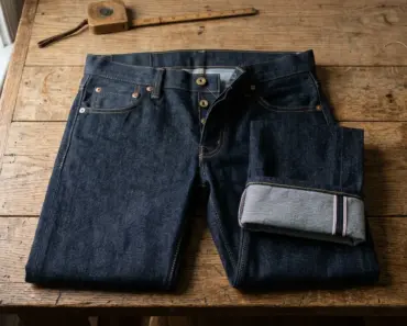
Use one color family in several depths, such as powder blue, denim, and navy. A tonal outfit is cohesive by design, while changes in texture prevent it from looking flat. Try a navy knit with mid-blue jeans and a pale-blue shirt, or combine cream, camel, and chocolate for a warmer version.
2. Analogous
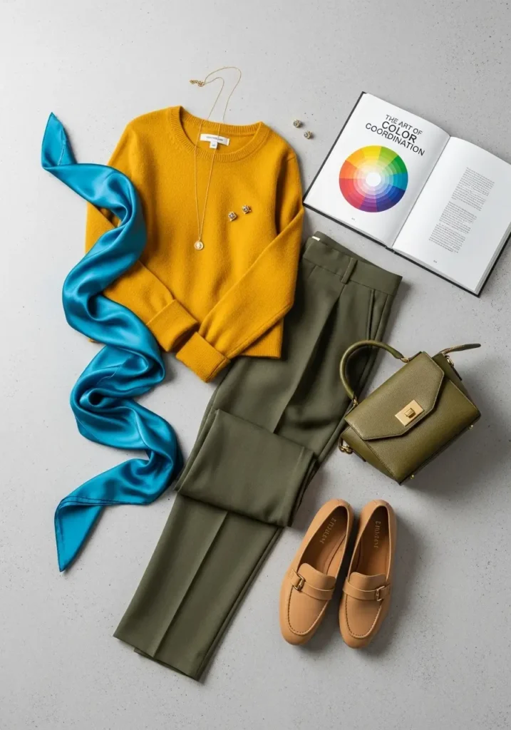
Analogous colors sit beside one another on the color wheel. Examples include blue with teal, or rust with terracotta and warm pink. Because the hues share visual qualities, these combinations often feel smooth and connected. Let one color lead and use the neighboring shade in a smaller garment or accessory.
3. Complementary
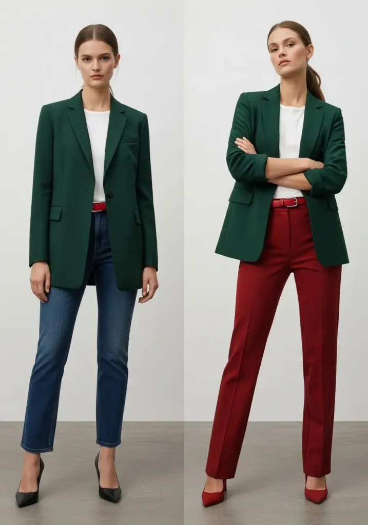
Complementary colors sit opposite each other on the wheel, such as blue and orange or purple and yellow. Their contrast is naturally strong. For an everyday outfit, soften one or both colors: slate blue with rust is easier to wear than equally bright blue and orange, while lavender with butter yellow offers a gentler contrast.
4. Triadic
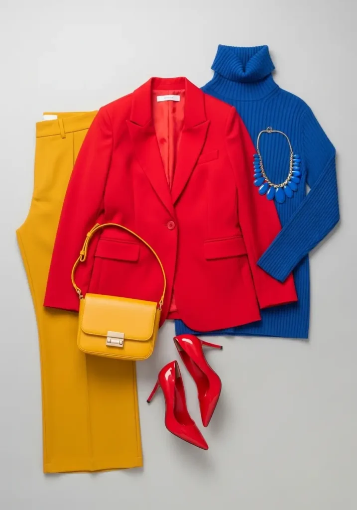
A triadic scheme uses three colors spaced around the wheel. It can look lively, so avoid giving all three equal visual weight. Wear one as the base, a second in a smaller piece, and the third in a bag, scarf, or shoe.
The Color Details That Matter More Than Rules
Match Intensity Before Matching Exact Shades
Two colors often cooperate when their saturation feels similar. Dusty rose and sage are both muted; cobalt and vivid red are both saturated. If a combination feels unbalanced, the problem may be intensity rather than hue. Add a neutral, or replace one bright color with a softer or deeper version.
Use Undertones as a Guide, Not a Restriction
Colors can lean warm, cool, or relatively neutral. Cream, camel, rust, and olive commonly form a warm group; optic white, charcoal, cobalt, and blue-based pink form a cooler one. Repeating a similar temperature can make coordination easier, but warm and cool shades can also create attractive contrast. Personal color analysis is optional: natural light, a mirror, and side-by-side comparison are more useful than treating a seasonal label as a fixed rule.
Control Contrast With Placement
High contrast attracts attention. Place the brightest or lightest color where you want the eye to go. A red bag can energize a black-and-white outfit; a light shirt under a dark jacket draws attention toward the face. When you prefer a quieter look, keep neighboring garments close in value—their relative lightness or darkness.
A Simple Proportion Formula
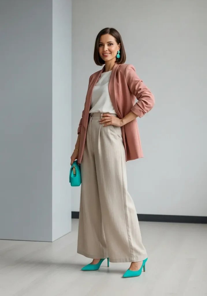
The familiar 60-30-10 idea is a useful visual shortcut, not a measurement requirement. Think of it as:
- Dominant color: the coat, suit, dress, or trousers that occupy most of the look.
- Secondary color: a top, cardigan, or layer that creates separation and depth.
- Accent color: a smaller detail such as a bag, belt, scarf, jewelry, or shoes.
For example, build around charcoal trousers and a charcoal coat, add a soft-blue shirt, then finish with a burgundy bag. If prints or visible metal hardware introduce extra colors, they do not automatically make the outfit too busy; what matters is whether one clear palette still leads.
Notable Clothing Color Trends for 2026
Runway trends offer ideas rather than instructions. Spring and summer 2026 collections included both quiet whites and powdery pastels as well as saturated red, emerald, violet, cobalt, lime, and citrus tones. Current Vogue runway color reporting reflects that range, so you can participate through a full look or one inexpensive accent.
Powder Blue and Soft White
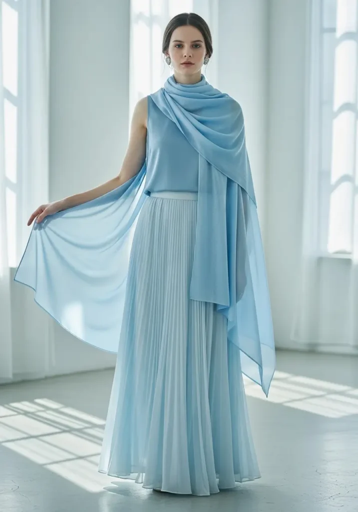
This low-contrast pairing feels light and polished. Try a powder-blue shirt with off-white trousers, a pale-blue dress with a cream bag, or blue denim with a white tee and a soft-blue cardigan. Choose optic white for a crisper result or ivory for a warmer, softer transition.
Cloud White With Texture
Soft white was prominent across 2026 fashion coverage, including Pantone’s Cloud Dancer. Instead of relying on color contrast, combine different surfaces: cotton poplin, ribbed knit, linen, satin, or suede. For the official color reference and professional palette tools, visit Pantone’s official website.
Red With Pink
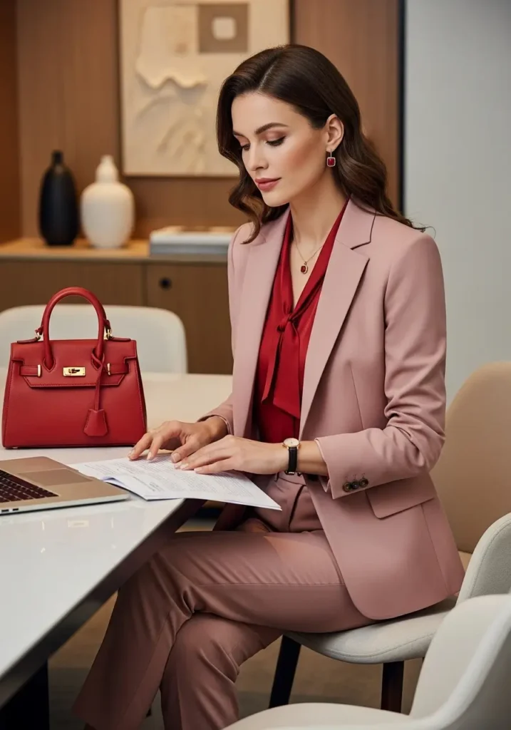
Red and pink belong to the same broad color family, but their difference in intensity creates energy. Let dusty rose cover more of the outfit and use cherry red in a shoe or bag for an approachable version. If you prefer a bolder look, pair a red dress with a pale-pink coat and neutral accessories.
Butter Yellow With Sky Blue
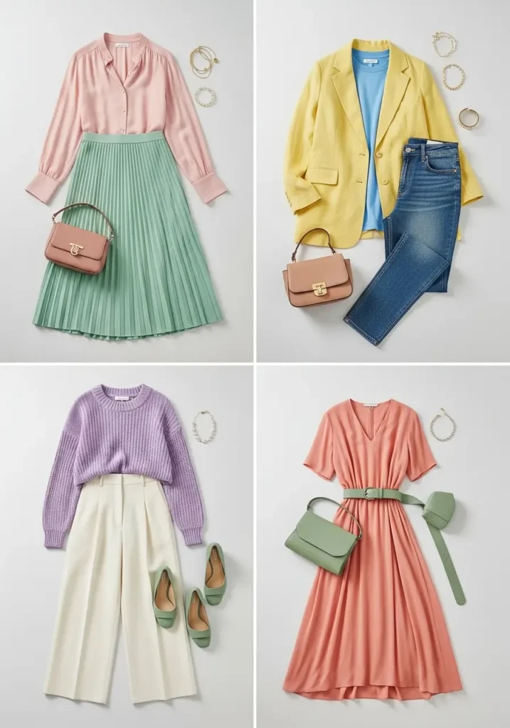
Butter yellow and sky blue provide gentle warm-cool contrast. Denim is the simplest bridge: wear a pale-yellow knit with medium-wash jeans and a cream shoe. Lavender with cream, mint with soft white, and peach with pale gray offer similarly soft alternatives.
Earth Tones and Warm Browns
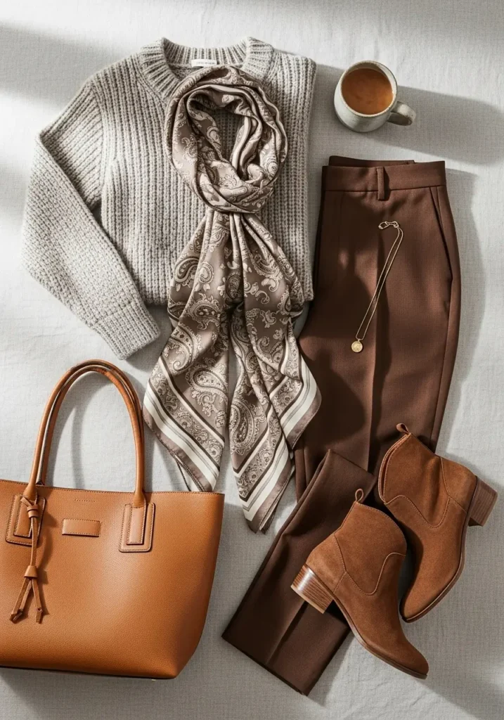
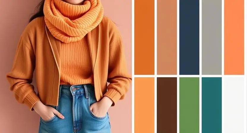
Sage, olive, terracotta, camel, chocolate, and cream are easy to mix because they share a grounded, muted quality. Combine chocolate trousers with a cream shirt and an olive jacket, or wear terracotta as the accent against camel. These colors also transition well between seasons by changing fabric weight.
Jewel Tones and Rich Autumn Shades
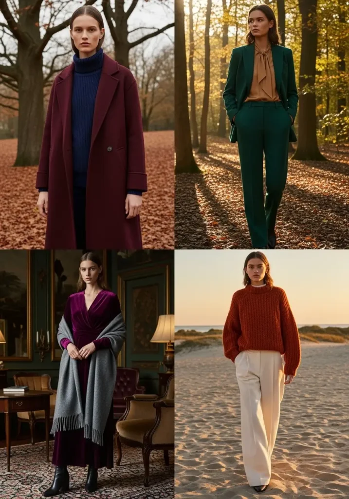
For cooler months, burgundy with navy, forest green with camel, plum with charcoal, and burnt orange with cream provide depth without requiring head-to-toe dark color. Deep colors are especially effective in textured materials such as wool, corduroy, suede, and velvet.
How to Make Color Blocking Wearable
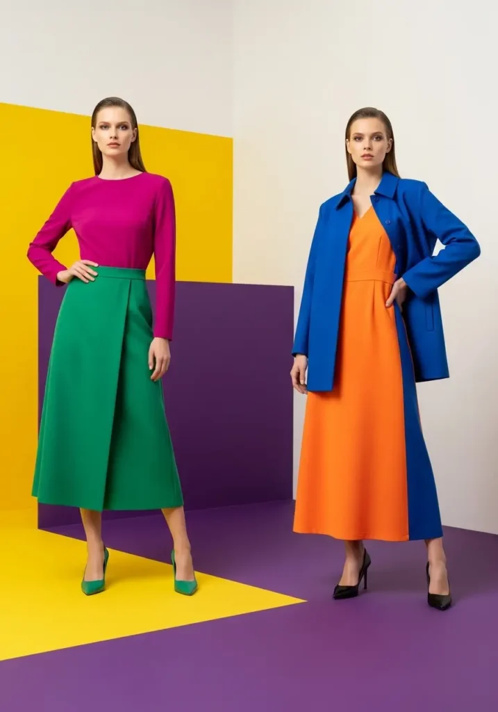
Color blocking places distinct areas of solid color next to each other. Start with two colors and clean silhouettes so the palette remains the focus. A cobalt shirt with tomato-red trousers makes a bold statement; a camel coat over that combination gives the eye a place to rest. If two saturated colors feel overwhelming, move one to a smaller area or choose a muted version.
- Repeat one color in a small detail to make the combination feel deliberate.
- Use denim, white, cream, gray, navy, or brown as a visual pause.
- Keep competing prints minimal when the color contrast is already strong.
- Check the outfit in daylight because indoor bulbs can shift color perception.
Coordinating Bags, Shoes, and Jewelry
Your bag and shoes do not need to match exactly. They can repeat an existing color, continue the outfit’s temperature, or create a controlled contrast.
| Outfit Palette | Bag Color | Result |
|---|---|---|
| Powder blue, denim, and white | Cognac | Warm contrast |
| Camel, cream, and chocolate | Forest green | Muted harmony |
| Black and white | Red or cobalt | Clear focal point |
| Pastel color blocking | Ivory or metallic | Quiet finish |
| Several bright colors | Neutral drawn from the outfit | Visual balance |
How to Style a Beaded Bag
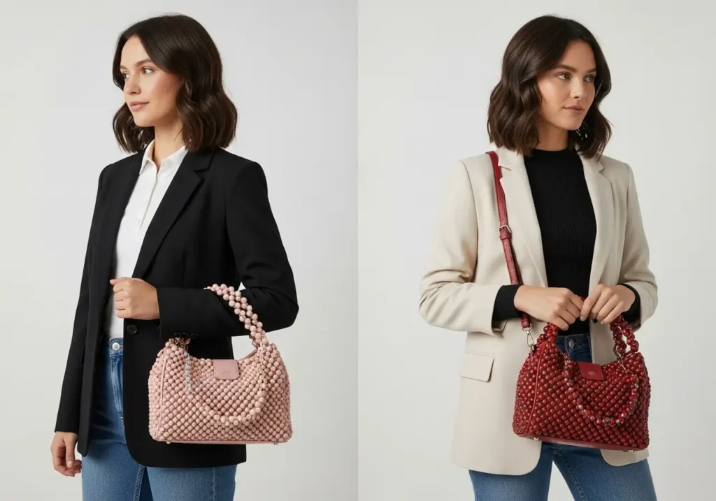
Beaded and embellished bags remain visible in 2026 accessory coverage, with versions ranging from compact pouches to practical totes. British Vogue’s 2026 beaded-bag coverage notes their return across spring and summer collections. Treat the beads as both color and texture.
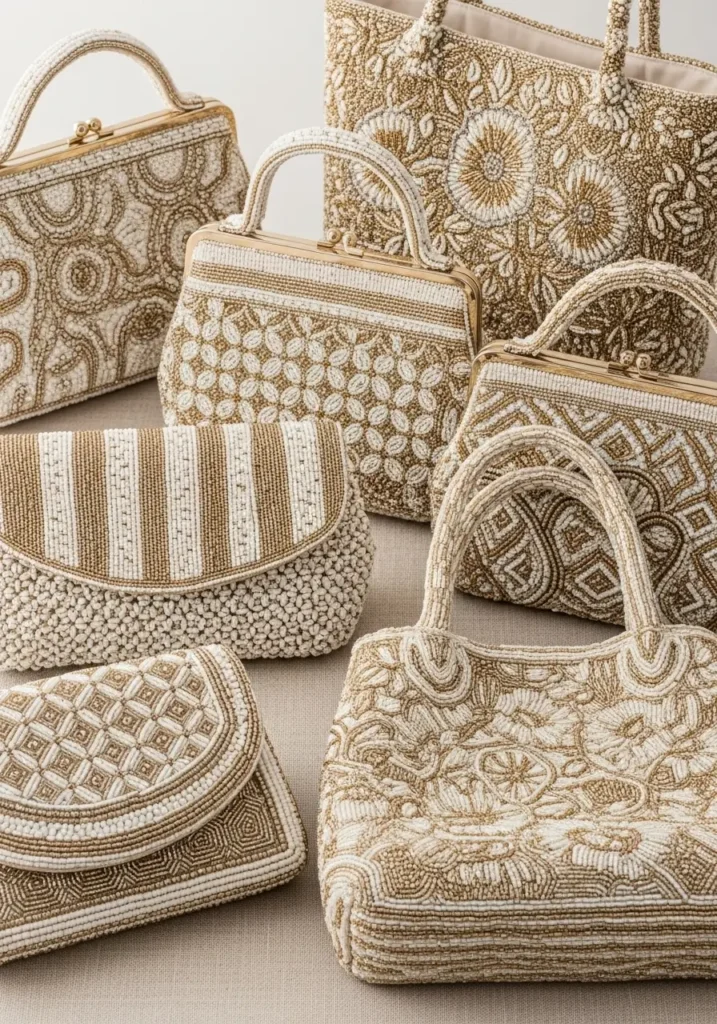
A cream, gold, silver, or wood-toned beaded bag can calm an outfit with bold color blocks. A multicolored version works best when at least one bead color echoes the clothing. With a patterned dress, pick up a minor color from the print instead of trying to match the dominant shade exactly.
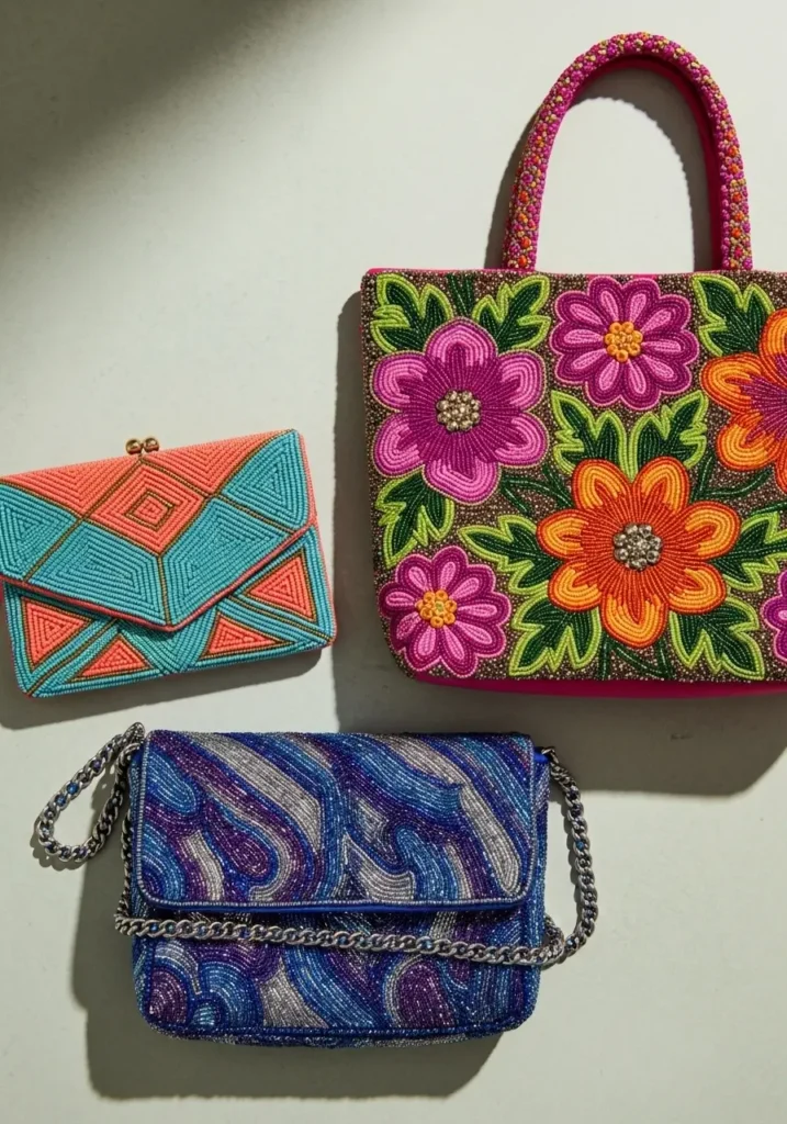
Balance texture as well as color. A detailed bag stands out against cotton, linen, denim, or a simple knit, while multiple heavily embellished pieces can compete. For more texture-led inspiration, explore these crochet handbag ideas.
Crossbody and Sling Bags
A sling or crossbody bag creates a visible diagonal line, so its color may have more impact than its size suggests. Repeat the bag color once—perhaps in a shoe, stripe, or small jewelry detail—or let it stand alone as the focal point. Comfort still matters: adjust the strap so the bag sits securely without distorting the clothing underneath.
Build a Personal Palette From Clothes You Already Wear
A useful palette reflects your routine, climate, laundry habits, and favorite garments. It does not have to follow a trend or a prescribed color season.
- Identify your most-used neutral. Choose the navy, black, charcoal, camel, cream, brown, or denim you reach for most often.
- Add one companion neutral. Select a lighter or darker shade that already works with your shoes and outerwear.
- Choose two accent colors. One can be quiet and one saturated, such as sage and red or dusty blue and rust.
- Photograph five successful outfits. The images will reveal repeated combinations and missing pieces more clearly than a shopping list.
- Test new purchases against three existing items. If a piece works with only one outfit, decide whether its cost and use justify the exception.
Outfit Formulas for Work, Weekends, and Events
Polished Workwear
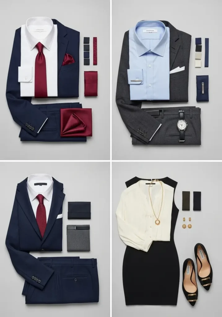
- Navy trousers + white or pale-blue shirt + burgundy shoe or bag
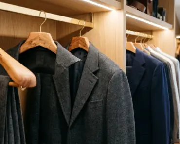
- Charcoal suit + cream knit + silver or deep-green accent
- Black separates + camel coat + gold-toned jewelry
For a traditional workplace, place brighter colors in smaller areas. Dress codes vary, so observe the level of formality around you instead of assuming a particular color always communicates authority or professionalism.
Amazon US Verified
Natural Red Cedar Wood Coat Hanger Set
Contoured cedar hangers preserving jacket shoulders while repelling moths naturally.
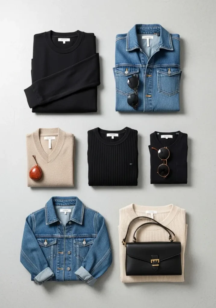
In a more expressive setting, try emerald with camel, dusty rose with sage, or terracotta with navy. Structure can balance adventurous color: a clean blazer, straight trouser, or simple midi dress keeps the outfit polished.
Relaxed Weekend Outfits
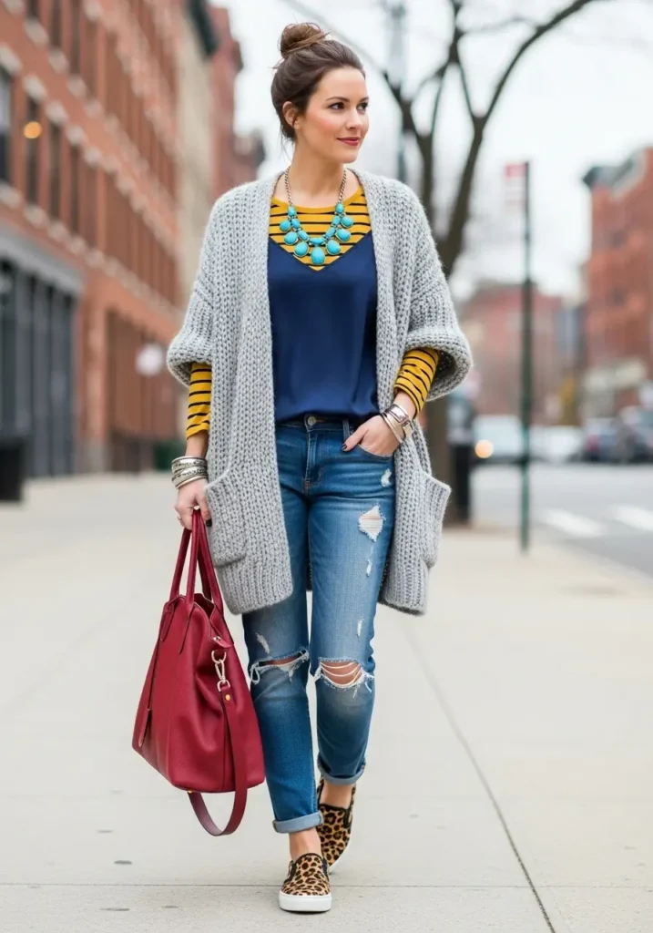
- Blue jeans + white tee + red cardigan
- Olive utility trousers + cream sweatshirt + tan sneakers
- Charcoal leggings + lavender knit + gray outer layer
- Denim shirt + navy trousers + cognac crossbody bag
Summer Dresses and Event Outfits
Let a printed dress provide the palette. Choose shoes from its background color and a bag from one of its smaller accent shades. For a solid dress, metallic, neutral, or complementary accessories can change the mood without changing the main garment. These summer dress ideas for women over 40 offer additional silhouette and styling inspiration.
Use Style References Without Stereotyping
Regional labels can be useful as mood-board shorthand, but they do not describe how everyone in a place dresses. Use the following images as distinct styling directions rather than rules tied to where you live.
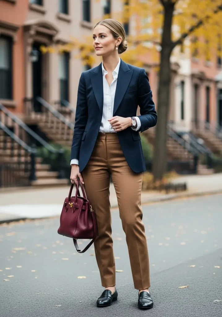
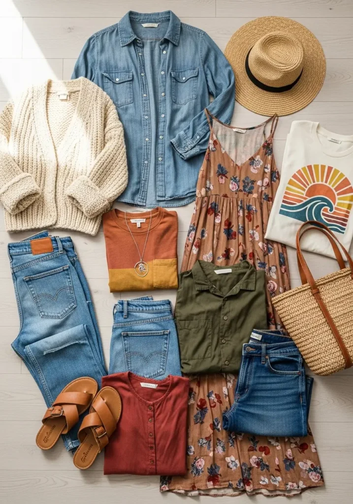
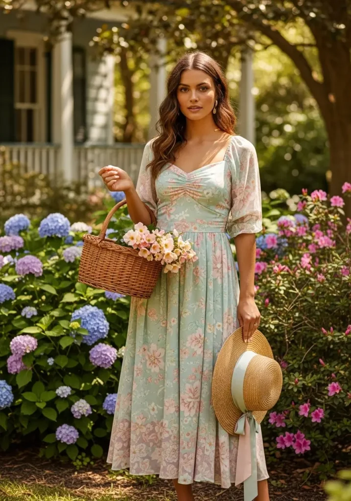
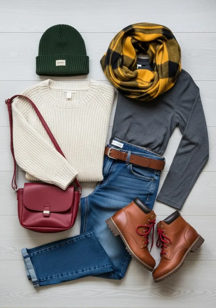
You might combine tailored navy and white one day, relaxed denim and terracotta the next, and soft florals for an event. A personal wardrobe can contain several visual moods while still sharing the same base colors.
Common Color-Coordination Problems and Fixes
The Outfit Contains Too Many Competing Colors
Fix: Identify the two colors you want people to notice. Replace another large color area with a neutral, or move it to a smaller accessory. Prints can count as one coordinated element when their colors already repeat elsewhere.
Everything Matches Too Exactly
Fix: Vary the depth or texture. Instead of identical blue shoes and bag, try navy shoes with a powder-blue bag, or keep one blue and make the other cognac or metallic.
The Colors Look Disconnected
Fix: Add a bridge piece containing both colors, such as a printed scarf, striped knit, patterned bag, or jewelry with mixed stones. Repeating one hue in a small detail can also restore cohesion.
The Online Color Looks Different at Home
Fix: Product photos, displays, and room lighting can alter perceived color. Check return terms, compare the item in daylight, and judge it beside the garments you intend to wear.
Shop More Strategically
| Priority | Useful Categories | Color Approach |
|---|---|---|
| Foundation | Trousers, everyday tops, jackets | Your most-worn neutrals |
| Flexible color | Knitwear, shirts, casual dresses | Two repeatable accent colors |
| Statement | Bags, scarves, event pieces | Seasonal or high-contrast shades |
Before buying, build at least three outfits around the item using clothes you own. A new scarf, shoe, belt, or beaded bag can update several neutral outfits for less money and storage space than replacing major garments.
Useful Amazon Finds for Building a Color-Coordinated Wardrobe
The following tools and accessories can help you compare colors, introduce an accent shade, or organize clothes so coordinating outfits takes less time. Check the selected color, dimensions, materials, and current availability before ordering because Amazon listings can change.
Colorato Seasonal Color Analysis Swatch Keychain
A portable swatch guide lets you compare clothing and accessory colors while shopping. The Colorato Seasonal Color Analysis Swatch Keychain includes a curated seasonal palette on compact acrylic cards. Choose the seasonal version that fits your preferred palette; it should be treated as inspiration rather than a strict rule about what you can wear.
WADORN Four-Piece Color Analysis Template Card Set
For experimenting with several palettes, the WADORN Four-Piece Season Color Analysis Template Card Set can be held near the face to compare how different color groups look in natural light. Take photographs with each card under the same lighting conditions for a more useful side-by-side comparison.
Handmade Beaded Boho Clutch and Crossbody Bag
The Handmade Beaded Boho Clutch Purse combines beadwork, embroidery, and fringe, making it most effective as the focal point of a simple outfit. Pair it with a solid dress, denim and a neutral shirt, or clothing that repeats one of the bag’s smaller accent colors. Its convertible design also allows it to be carried as a clutch or crossbody bag.
Kattee Leather Crossbody Sling Bag
A neutral sling bag can connect multiple outfits without needing to match every garment exactly. The Kattee Leather Crossbody Sling Bag for Women is a compact everyday option that works particularly well with denim, navy, cream, olive, camel, and warm brown. Select the available shade that best coordinates with the shoes and outerwear you already own.
RIIQIICHY Large Satin-Feel Square Scarf
A patterned scarf is one of the easiest ways to bridge two colors that otherwise feel disconnected. The RIIQIICHY 35-Inch Satin-Feel Square Scarf is large enough for several styling methods, including wearing it around the neck, over the hair, or tied to a handbag. It is described as a silk-like fabric rather than genuine silk, so review the material information and care instructions before purchasing.

Amazon US Verified
ChomChom Roller High-Efficiency Lint Remover
Reusable pet hair and lint cleaning roller requiring no sticky tape or refills.
ManGotree Velvet Pants and Skirt Hangers
Organizing clothing by color makes available combinations easier to see. The ManGotree Velvet Pants and Skirt Hangers have movable clips for displaying trousers and skirts alongside coordinating tops and jackets. Their slim profile can also help conserve hanging space, although heavier garments should remain within the manufacturer’s recommended capacity.
Shopping tip: Before ordering an accessory, identify at least three outfits you could wear with it. A useful purchase should repeat a color already in your wardrobe, provide a deliberate contrast, or help several existing pieces work together.
Care for Colorful Clothes and Accessories
Always follow the garment’s care label because fiber, dye, construction, and finish determine safe cleaning. Washing similar colors together, turning many garments inside out, avoiding unnecessary heat, and air-drying when appropriate can help reduce wear. Cold water is suitable for many colored items, but stains, hygiene needs, and care instructions may call for another temperature.
Store beaded bags where they will not snag knitwear or delicate fabric. Use a dust bag or breathable cover, avoid overfilling, and support the shape without putting pressure on beadwork. Keep long sling straps untwisted and loosely arranged rather than sharply folded.
Digital Tools That Make Planning Easier
A phone camera may be the most practical wardrobe tool: save successful outfits in an album and review them before shopping. Palette generators can sample colors from a favorite garment, while wardrobe apps can track combinations and reveal which pieces receive little use. For current runway ideas, browse Vogue’s fashion section, then translate the colors into silhouettes and price points that fit your life.
A Practical Starting Point
Choose one combination to test this week: cream and chocolate with sage, powder blue and white with cognac, or charcoal and black with a red accent. Photograph the result, notice whether the contrast and proportions feel right, and adjust one element at a time. The best clothing color combinations are not those that obey the most rules; they are the ones you can repeat, adapt, and enjoy wearing.
Frequently Asked Questions
How Many Colors Can One Outfit Include?
Two or three prominent colors are a simple starting point, but there is no absolute maximum. A multicolored print may contain many hues and still look cohesive. Focus on one dominant palette and prevent several saturated colors from competing in equal proportions.
Can Warm and Cool Colors Be Worn Together?
Yes. Warm-cool contrast can make an outfit more interesting. Try cool blue with warm cognac, lavender with butter yellow, or charcoal with rust. If the contrast feels too sharp, soften one shade or add a neutral bridge.
What Are the Most Versatile Capsule-Wardrobe Colors?
The best neutrals are the ones already compatible with your shoes, coats, and daily routine. Navy, denim, cream, camel, chocolate, charcoal, black, and white are common options. Choose one dark neutral, one light neutral, and two accent colors rather than assuming the same palette works for everyone.
Should a Handbag Match Shoes?
No. Matching can look polished, but coordination is enough. The bag and shoes can share an undertone, repeat different shades from the outfit, or let one remain neutral while the other provides the accent.
Disclosure: This post contains affiliate links. If you purchase through these links, Azuloz may earn a commission at no additional cost to you.
As an Amazon Associate, azuloz.com earns from qualifying purchases.